Vibrant Offices, Vibrant Results

Revive Painting • June 27, 2024
commercial paint project saskatoon

In today's competitive business landscape, creating a vibrant and productive office environment is crucial for fostering creativity, boosting morale, and maximizing business outcomes. One often underestimated aspect of achieving this is through thoughtful office painting. The colors you choose for your workspace can significantly impact mood, productivity, and even the perception of your brand. This article explores the strategic use of color in office spaces and how it can lead to vibrant results for your business.


Choosing the Right Colors for Your Office Space


The first step in transforming your office into a vibrant space is selecting the right colors. Colors have a profound psychological impact on human behavior and emotions. For instance, shades of blue and green are known for their calming effects, making them ideal for high-stress environments or areas where focus is critical, such as conference rooms or individual workstations. On the other hand, warm tones like yellow and orange can evoke feelings of energy and positivity, making them suitable for creative hubs or collaborative spaces.

When choosing colors for your office, consider your industry and brand identity. For businesses in finance or law, where professionalism and trustworthiness are paramount, neutral tones like grays, whites, or muted blues can convey a sense of reliability and stability. In contrast, industries such as marketing or design may benefit from bold, stimulating colors that inspire innovation and originality.


Enhancing Productivity with Thoughtful Color Schemes


Beyond aesthetics, the right color schemes can significantly enhance productivity among your employees. Studies have shown that certain colors can stimulate brain activity and improve focus. For tasks that require concentration and attention to detail, such as data analysis or content creation, choosing colors like soft blues or greens can help employees stay on task without feeling overwhelmed.

Moreover, a well-balanced color palette throughout the office can create a sense of cohesion and organization, reducing stress and promoting a more efficient workflow. Consider using complementary colors or analogous color schemes to create visual interest while maintaining harmony. For example, pairing cool blues with warm neutrals can create a balanced and inviting atmosphere that supports both productivity and comfort.


Maximizing Business Value through Office Painting


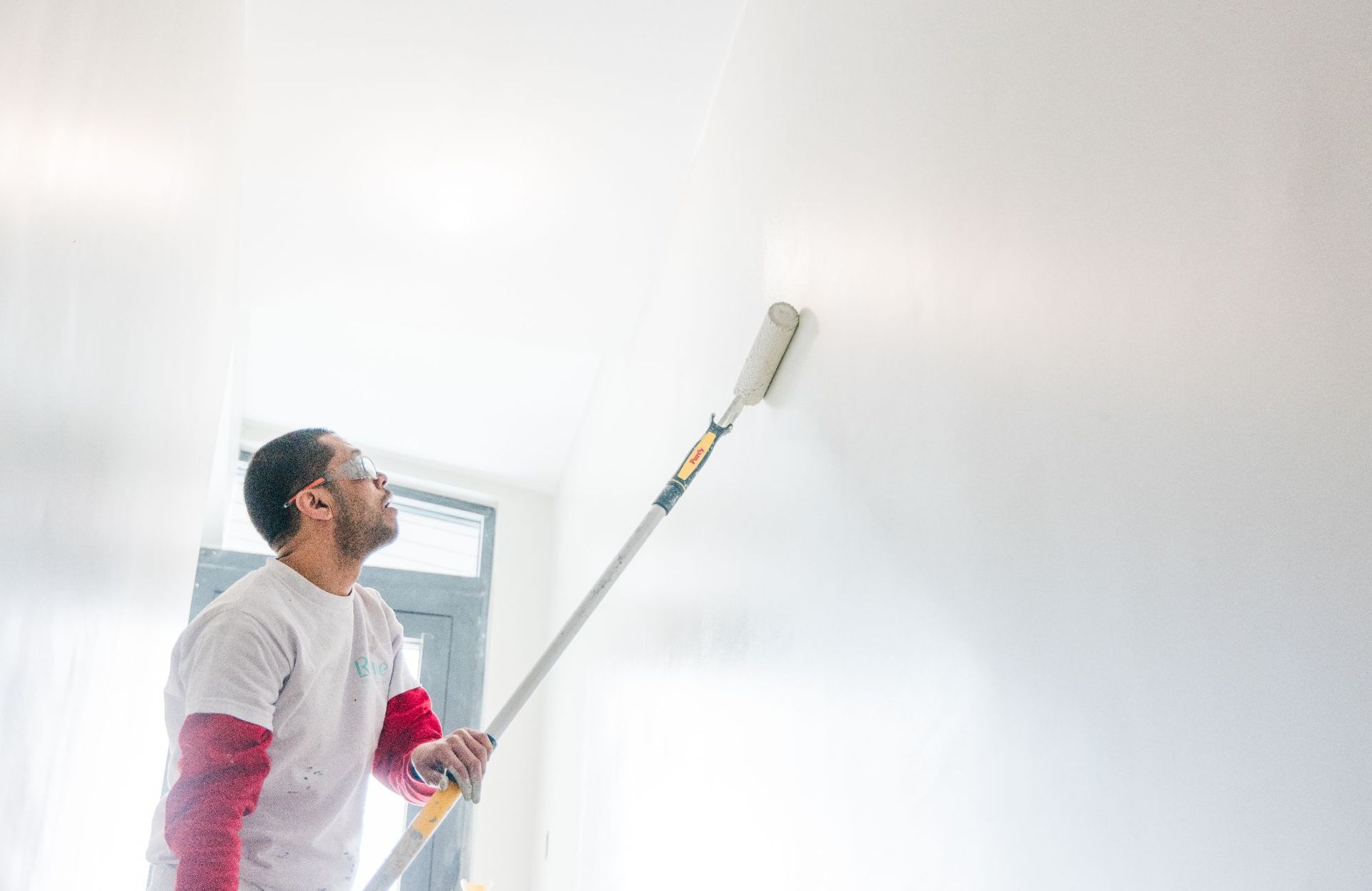
Investing in professional office painting isn't just about aesthetics; it's about maximizing business value. A freshly painted office space not only looks appealing to clients and visitors but also demonstrates your commitment to maintaining a professional image. A well-maintained environment can enhance your brand's reputation and instill confidence in your stakeholders, ultimately contributing to long-term business success.


Additionally, regular maintenance and updates to your office space through painting can prevent wear and tear, prolonging the lifespan of your interior surfaces and saving on costly renovations in the future. This proactive approach not only saves money but also ensures that your office remains a vibrant and inspiring place for employees to thrive.


The Importance of a Fresh Coat in Commercial Spaces


Commercial spaces, such as retail stores or corporate headquarters, often experience high foot traffic and constant use. As a result, walls and surfaces can quickly become worn or dull, impacting the overall look and feel of the space. A fresh coat of paint can revitalize these areas, creating a clean and inviting environment that reflects positively on your business.

Moreover, updated paint colors can align with evolving branding strategies or interior design trends, keeping your commercial space modern and appealing to customers and employees alike. Whether you're refreshing a storefront to attract more foot traffic or revitalizing an office to boost employee morale, the impact of a fresh coat of paint should not be underestimated in commercial settings.


Creating a Welcoming Atmosphere with Office Painting


One of the most significant benefits of office painting is its ability to create a welcoming and inclusive atmosphere for employees and clients. The colors you choose can influence how people feel when they enter your space, affecting their overall experience and perception of your company. Warm tones like earthy browns or soft yellows can create a sense of comfort and hospitality, ideal for reception areas or client meeting rooms.


Furthermore, incorporating accent walls or creative paint techniques can add personality and charm to your office environment, distinguishing your space from competitors and leaving a lasting impression on visitors. By thoughtfully curating the ambiance through strategic office painting, you can foster a positive and inviting culture that enhances collaboration, creativity, and overall satisfaction among your team members.


Budget-Friendly Tips for Commercial Painting Projects


While the benefits of office painting are clear, managing costs is also a crucial consideration for businesses. Fortunately, there are several budget-friendly tips to optimize your commercial painting projects without compromising on quality. First, prioritize areas that receive the most visibility, such as client-facing spaces or high-traffic corridors, to maximize the impact of your investment.

Second, consider scheduling painting projects during off-peak times or holidays when business operations are less disrupted. This allows painters to work efficiently without interrupting daily activities, minimizing downtime and ensuring a seamless transition. Additionally, working with experienced commercial painters who offer competitive pricing and adhere to strict timelines can streamline the process and deliver superior results within your budget constraints.


How Color Psychology Influences Workplace Dynamics


Color psychology plays a significant role in shaping workplace dynamics and employee behavior. Certain colors can evoke specific emotions and attitudes, influencing how individuals interact with their environment and each other. For instance, collaborative spaces benefit from vibrant colors like greens or purples, which encourage teamwork and creativity.


On the other hand, areas designated for focused work may benefit from calming colors like blues or grays, promoting concentration and productivity. By strategically applying color psychology principles to your office design, you can create a dynamic and supportive environment that enhances communication, boosts morale, and fosters a positive company culture.


Maintaining Vibrancy: Long-term Benefits of Office Painting


Lastly, investing in regular office painting offers long-term benefits that extend beyond aesthetics. A well-maintained workspace not only enhances employee satisfaction and productivity but also contributes to the overall health and safety of your workplace environment. Fresh coats of paint can protect surfaces from wear, moisture, and contaminants, ensuring a clean and hygienic atmosphere for everyone.


Furthermore, ongoing maintenance and updates to your office's interior can reflect positively on your brand's commitment to quality and professionalism. By staying proactive with office painting projects, you can prevent costly repairs and renovations down the road, ultimately saving time and money while preserving the integrity of your workspace.


Transform Your Workspace: Achieve Vibrant Offices and Vibrant Results with Revive Painting


Ready to transform your office into a vibrant hub that enhances productivity and boosts business value? Whether you're looking to refresh your commercial space with a new coat of paint or strategically use color psychology to create a welcoming atmosphere, Revive Painting is here to help. Our expert team specializes in commercial and office painting, delivering quality results that align with your brand's vision and budget. Contact us today to schedule a consultation and discover how our professional painting services can revitalize your workspace.


interior painting eggshell white
By Revive Painting May 20, 2026
High-Impact Paint Colours That Raise Property Value Turns out, according to recent buyer data , people are leaning toward deeper, richer paint colours over the usual light neutrals—especially when it comes to resale value. Picking the right colours for the right rooms can actually bump your home's sale price up by thousands in Saskatoon’s wild market. Nature-Inspired and Trend-Driven Hues Right now, dark olive green is stealing the spotlight in kitchens. Buyers are apparently willing to cough up as much as $1,597 more for homes with muted green cabinets. It fits this whole organic modern vibe—think natural colours and sustainable touches that just feel right. Meanwhile, navy blue is making bedrooms and other spaces feel like a calm retreat. It’s modern, but it doesn’t try too hard. And then there’s charcoal gray —still the go-to for living rooms, and it could add up to $2,593 to your home’s value. Not too shabby, right? These richer tones work because they’re personal but not polarizing. They’re a big step up from stark whites or builder beige —they just feel more intentional. If you’re not feeling bold, greige or warm whites are solid options too. They’re safe, but not boring. Honestly, the trick is to pick colours that bring out the best in your home’s architecture and still appeal to Saskatoon buyers—especially those who love that blend of modern design and natural elements. Room-Specific Colour Recommendations It’s smart to have a colour game plan for each room. Here’s what seems to work: Kitchens : Olive green—on cabinets or as an accent—gets the most love. Any muted green here can turn an outdated kitchen into something buyers actually get excited about. Bedrooms : Navy blue walls are a winner, apparently adding around $1,815 to sale prices. It just makes the space feel restful and a bit luxurious—who wouldn’t want that? Living Rooms : Charcoal gray is still the favourite. It’s versatile, goes with almost any furniture, and adds a bit of drama without being overwhelming. Bathrooms : Mid-tone browns like mocha are surprisingly popular. They give off that spa vibe—warm, earthy, and just a bit upscale. Buyers seem to eat that up. Every room’s got its own vibe, so your colours should play to that. But you still want things to flow together—nothing too jarring from one space to the next. Avoiding Colours That Lower Value Some colours? Just don’t. Daisy yellow in kitchens is a hard no—buyers will actually offer $3,915 less if they see it. Same deal in living rooms, where it can drop your value by $3,891. Fire hydrant red is another one to avoid. A red living room might cost you $1,820, and red bedrooms could shave $1,987 off your offers. Most people just see extra work when they walk into a room like that. And even some trendy picks fall flat. Pale sky blue and light sage green sound nice, but they don’t perform as well as richer shades. First impressions matter—a lot. So, maybe skip these lighter colours in spaces where buyers are sizing things up. Exterior Colour Strategies for Saskatoon's Market Getting the exterior paint colours right can totally change how your home’s valued—and how fast it sells. It’s a balancing act: you want something modern, but not so trendy it’ll look dated in a few years. The goal? Stand out, but not in a weird way. Curb Appeal Through Modern Neutrals Modern neutrals are still king in Saskatoon. Warm whites and greige are especially popular—they look great in listing photos and seem to work with pretty much any style of house. Plus, they don’t get washed out in Saskatoon’s bright winters or look dull in the summer. Charcoal gray is showing up more as a trim colour. It’s a nice switch from classic black or brown—adds depth, but isn’t too much. And it pairs up really well with lighter main colours. If you’re going the modern neutral route, here are a few combos that just work: Warm white body with charcoal gray accents Greige as your main colour, with crisp white trim Soft taupe paired with deeper greige details These palettes really do boost curb appeal . They’re fresh, but not so on-trend that they’ll feel dated next year. Plus, they let your home’s features stand out without screaming for attention. Balancing Classic and Contemporary Palettes Nature-inspired colours sort of bridge that space between what people have always expected and what’s trending now. Think soft sage greens, muted terracotta, warm stone—these shades echo Saskatoon's prairie scenery but also vibe with the whole organic modernism thing that's everywhere lately. Classic whites and creams? Still a solid bet, but honestly, tweaking them with a hint of something contemporary keeps things from feeling tired. A warm white with a touch of peach or a whisper of gray just feels more inviting than those stark, chilly whites. Trim colour—yeah, it matters just as much as your main paint. White trim is timeless, sure, but sometimes an off-white or a subtle neutral can give the whole place a little more depth. It's all about finding that sweet spot between the comfort of the classics and a bit of modern flair. That way, you’re not just appealing to the traditional crowd; you’re catching the eye of folks who want something a little more current, too.
Saskatoon house with heavy snow causing paint damage
By Revive Painting April 20, 2026
How Saskatoon's Freeze-Thaw Cycle Damages Exterior Surfaces Saskatoon 's climate subjects painted surfaces to repeated expansion and contraction as temperatures swing above and below freezing, while moisture infiltration during thaw periods creates internal pressure that compromises paint adhesion and substrate integrity. Ice damming and poorly insulated attics compound these issues by creating uneven temperature zones that accelerate paint breakdown. Understanding the Freeze-Thaw Process in Saskatchewan Saskatchewan's continental prairie climate creates intense freeze-thaw conditions throughout late winter and early spring. When daytime temperatures rise above 0°C, snow melts and water penetrates into microscopic cracks in paint and siding materials. At night, temperatures frequently drop well below freezing, causing this trapped moisture to freeze and expand. This expansion exerts significant force on painted surfaces. Water expands by approximately 9% when it freezes, creating pressure that widens existing cracks and loosens paint from the substrate. The cycle repeats dozens of times each season in Saskatoon, progressively degrading exterior finishes . We see the most severe damage on south and west-facing walls where solar heating accelerates daytime thaw while overnight temperatures still plummet. North-facing surfaces experience less dramatic temperature swings but often retain moisture longer, creating different deterioration patterns. Physics of Snow Melt and Daily Temperature Swings Temperature fluctuations in Saskatoon during spring can exceed 20°C within a 24-hour period. These rapid swings cause painted surfaces to expand when warm and contract when cold. Paint films that have lost flexibility through aging cannot accommodate this movement and develop stress fractures. Snow melt introduces substantial moisture loads to building exteriors. As accumulated snow on roofs and against walls melts, water runs down surfaces and seeks entry points through compromised paint or caulking. Dark-colored paint absorbs more solar radiation, creating localized warm spots that accelerate melt rates and increase moisture exposure. The combination of thermal stress and moisture creates ideal conditions for paint failure . Substrates like wood absorb water during thaw periods and then contract as temperatures drop, creating a mechanical pumping action that forces paint away from the surface. Common Exterior Paint Failures During Thaw Cycles Peeling and blistering are the most visible signs of freeze-thaw damage. Moisture trapped beneath the paint film expands when frozen, breaking the bond between paint and substrate. We observe peeling starting at edges, seams, and areas where water naturally collects. Cracking and alligatoring develop when paint loses elasticity and cannot flex with temperature changes. These patterns create a network of fissures that allow more moisture penetration, accelerating deterioration. Chalking and fading occur as freeze-thaw cycles break down paint binders. The surface becomes powdery and color pigments degrade, particularly on surfaces with maximum sun exposure. Wood substrates show rot and decay when compromised paint allows sustained moisture contact. We identify this by soft spots, discoloration, or visible fungal growth beneath failing paint. Impact of Poorly Insulated Attics and Ice Damming Poorly insulated attics create temperature differentials that contribute to ice damming on roof edges. Heat escaping through inadequate insulation warms roof surfaces, melting snow that then refreezes at cooler eaves. This ice buildup forces water under shingles and behind fascia boards, saturating painted trim and soffits. Ice damming causes water to pool against exterior surfaces for extended periods. This prolonged exposure allows deep moisture penetration into paint and substrate materials. We find that homes with ice damming consistently show accelerated paint failure on eaves, fascia, and upper wall sections. The freeze-thaw damage from ice damming extends beyond roof lines. Overflowing gutters and ice buildup direct water onto wall surfaces not designed for heavy moisture exposure, creating premature paint breakdown and potential structural damage to underlying materials. Warning Signs You Need to Repaint After a Freeze-Thaw Season Saskatoon's freeze-thaw cycles leave visible marks on exterior paint that signal when protection has failed. We can spot these issues by examining paint surfaces, tracking moisture patterns after snow melt, and checking how water moves away from our homes. Cracking, Peeling, and Bubbling Paint Cracking appears when paint loses flexibility during repeated expansion and contraction. We see hairline cracks that run horizontally along siding or larger splits that expose bare wood or substrate underneath. Peeling starts at edges where moisture works behind the film. South and west walls show this first because UV weakens the bond before winter stress arrives. When we spot paint lifting in sheets or curling at seams, the coating no longer protects what's beneath. Bubbling forms when trapped moisture turns to vapor or ice crystals push the film outward. These blisters feel soft when pressed and often cluster near joints, bottom courses of siding, or areas where snow piles against walls. Once bubbles break open, water enters freely and accelerates decay. Discoloration, Stains, or Fading After Snow Melt Vertical streaks and rust-colored stains appear when snow melt carries dirt, salts, and oxidized metals down painted surfaces. We notice these marks most clearly in spring when snow banks recede and reveal what winter left behind. Fading shows up as uneven color, especially on south-facing walls that take the most sun. Chalky residue on our fingers when we touch the surface means the binder has broken down. This powder no longer holds pigment in place or sheds water effectively. Water stains near the foundation or around windows indicate where moisture sat too long during thaw cycles. Dark patches on stucco or wood signal that the substrate stayed wet and the paint barrier failed. Moisture Intrusion and Its Effects on Exterior Paint Moisture travels into gaps opened by freeze-thaw movement. We find it behind paint at caulk lines that have pulled away, at the bottom of siding where end grain absorbed meltwater, and where flashing no longer diverts rain. Paint blisters, softens, or loses adhesion when water sits between the coating and substrate. Wood begins to rot, stucco develops efflorescence, and metal corrodes. These problems spread quickly once moisture breaches the film. We check shaded elevations and north walls that dry slowly after snow melt. Damp spots that remain visible days after rain or thaw tell us water is trapped and moving through the wall assembly. Addressing Drainage Issues: Downspouts, Sump Pumps, and Floor Drains Downspouts must carry water at least 1.8 meters away from the foundation. When they dump near walls, splash-back soaks lower siding and paint fails at the bottom courses. We inspect extensions after spring thaw to ensure they remain connected and grade properly. Properly functioning sump pumps and floor drains keep basements dry, which protects interior conditions that affect exterior paint performance. High indoor humidity from a failing sump pump migrates outward through walls and pushes paint off from behind. Snow melt pooling near the house signals grading problems or clogged drains. We look for: Ice dams at eaves that force water under paint Standing water against foundation walls Downspout discharge frozen or blocked Grade sloping toward the building instead of away When drainage fails, paint takes on more moisture than it was designed to handle and deteriorates within one or two freeze-thaw seasons. Is this your home? Let us know! Contact us today to help.