Why homeowners often choose the wrong exterior paint colour
You’ve probably driven through a neighborhood and spotted a house that made you think, “What were they thinking with that color?” Trust me, you’re not alone. Our painting team has covered thousands of Saskatoon homes. We’ve seen how even careful homeowners end up with
exterior paint colors
that miss the mark. It’s not their fault. Picking the perfect exterior house paint needs you to understand several tricky factors that most people learn about only after the paint dries.
1. Misjudging how colors look in natural light
Natural light plays tricks on exterior paint colors. That beautiful sage green from your sample might look like an odd yellow-green in the afternoon sun. Color experts say south-facing homes get such bright sunlight that colors look two to three shades lighter than expected. North-facing homes have a gray cast that makes colors look darker. Your perfect neutral might end up looking gloomy.
Different times of day create their own challenges. Your east-facing walls might look great in the morning but change by afternoon. One expert puts it well: “And then BOOM, the light’s gone, and just like magic, your home is a different color!”. This explains why paint chips that looked amazing in the store lead to disappointment on your walls.
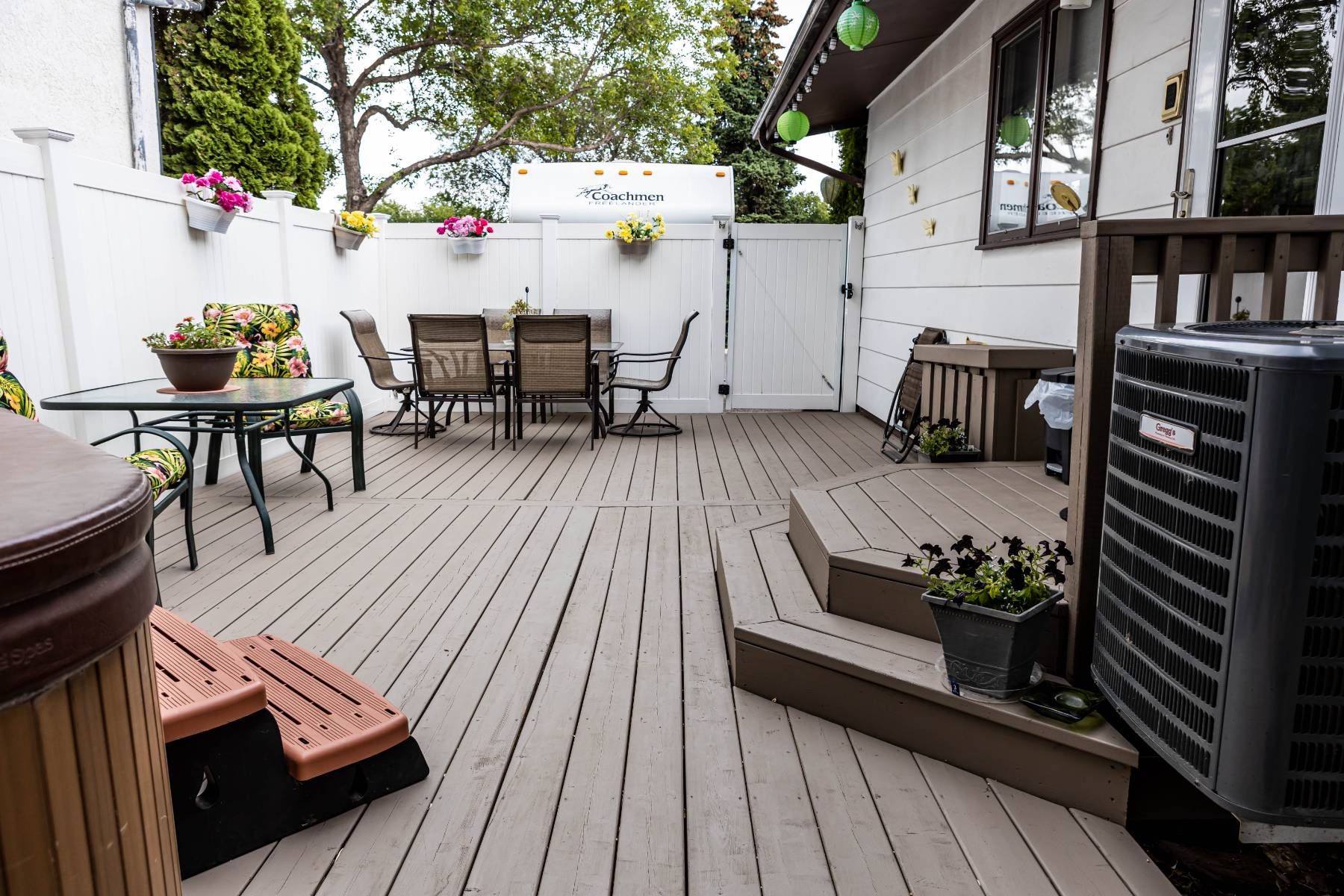
2. Ignoring how surroundings and landscaping affect color
Your Saskatoon home’s natural environment changes how exterior house colors look. People often pick colors without thinking about trees, grass, or neighboring houses. This leads to some surprising results.
Trees do more than provide shade. They cast green reflections on your home. Light filtering through trees can make lighter neutrals pick up green undertones. Even your lawn bounces light that changes how colors look. Those green tints in every paint sample? That’s probably why.
Your neighbor’s houses also affect how your color choice looks. Paint colors that ignore the neighborhood’s look can make your house stick out badly.
Outside paint for house
should blend with nearby homes while showing your style.
3. Overlooking the architectural style of the home
We see this mistake all over Saskatoon. People ignore what their home’s architecture needs in terms of color. Each
architectural style
works best with specific color palettes. Craftsman-style homes look amazing in earth tones that showcase their front porches and match their natural materials.
Contemporary homes look best with colors that match the landscape and create contrast with their design features. Greek Revival homes with their bold details traditionally use white as their signature color.
The wrong architectural color choice looks as odd as wearing a tuxedo to the beach. Even upscale neighborhoods have homes with paint that fights their architectural style. Your home looks timeless when you respect its architectural heritage while adding personal touches. This beats having a house that screams, “We built this during the gray trend”.
These three key factors can help you avoid joining homeowners who repaint too soon because they picked the wrong color first time around.
The role of paint finishes in color perception
Paint brings more than just color to your home—the finish matters just as much! Our years of painting homes in Saskatoon have taught us that many homeowners don’t realize how paint sheen can transform their
exterior paint colors
. The sheen gives your home its character and can make colors look completely different based on light reflection.
1. Flat vs. gloss: how sheen changes appearance
Ever painted a test patch in your garage only to find it looks totally different on your house? The secret lies in sheen—the amount of light bouncing off your painted surface.
Flat finishes
soak up light with about 12% reflectiveness, while glossy finishes act like mirrors with reflectiveness that can reach 85%.
Colors take on a new life with different sheens. A high-gloss finish makes colors look deeper and more vibrant than the same shade in flat paint. Sunlight hitting glossy surfaces makes colors pop with rich saturation. Flat finishes create a softer, more subtle look. Gloss levels also affect how we see architectural details—flat paint hides flaws while glossier finishes make every bump stand out.
2. Why satin is often the safest choice for siding
Satin finishes have become the top choice for exterior house paint because they hit the sweet spot. A reflectiveness of 25-40% creates a pearl-like look that balances between flat and shiny. This middle-ground sheen resists dirt well and forgives surface imperfections.
Satin has become more popular than glossier options for exterior siding. The finish stands up to Saskatoon’s tough weather changes and cleans up easily with a quick spray from the hose. Best of all, satin offers great UV protection without creating blinding glare on bright summer days.
3. Using gloss strategically on trim and doors
Semi-gloss and high-gloss finishes
work magic on trim, doors, and architectural details. Semi-gloss proves essential for doors and trim that need to last. The smooth surface creates beautiful contrast against siding and makes architectural features pop.
Glossy finishes create a tough shell that handles touching, weather, and cleaning. Front doors look elegant in semi-gloss while staying easy to maintain. The key is to use these shiny finishes carefully—too much gloss on large areas overwhelms the eye and shows every flaw.
A simple rule makes all the difference: low-luster finishes for big surfaces, higher sheen for spots you want to catch the eye. Flat paint blends into the background while glossier finishes draw attention right where you want it. This balance turns your
exterior house colors
from random choices into purposeful decisions—the mark of true professional results.
How climate and lighting affect exterior house colors
The sun does more than make you squint—it completely changes how your
exterior paint colors
look! I’ve seen countless homeowners in Saskatoon gasp when their “perfect beige” turns pink in the afternoon light. Let me explain why your home’s exterior might be playing these color tricks on you.
1. Sunlight and UV exposure
Sunshine secretly works against your paint. UV rays break down the chemical bonds in paint pigments, which makes colors fade as time passes. Dark colors take the biggest hit—red and blue shades fade faster than neutral ones. The science behind this is the sort of thing I love—UV radiation gets the paint polymers excited and creates free radicals that mix with oxygen to break down your paint’s binder molecules.
UV exposure makes your
exterior house paint
brittle, and this leads to cracks and peeling. Quality paints now come with UV inhibitors that reflect sunlight to stop early wear and tear. You can think of it as putting sunscreen on your house—it needs protection from our harsh prairie sun!
2. Seasonal changes in Saskatoon
Our extreme seasons create a color show for Saskatoon homes. Colors that look perfect under summer’s golden light might look totally different beneath winter’s blue-tinted skies. Houses facing south show these changes more than others as the sun moves through different angles all year.
Paint colors look darker in shade compared to direct sunlight. This explains why your “soft gray” might look just right on the sunny side but turns almost charcoal in shadier spots. The way colors look changes with humidity too, which swings wildly between our dry winters and humid summers.
3. How shadows and orientation influence color
Your home’s direction changes how
exterior house colors
look—sometimes by two or three shades! Walls facing south get intense sunlight that makes colors look much lighter than expected. Many homeowners pick darker shades for these walls to balance this washing-out effect.
North-facing surfaces get gray-tinted light that makes colors look darker and more muted. East-facing walls shine brightest in morning light but darken by afternoon. The most dramatic change happens on west-facing walls—they bathe in golden-orange afternoon light that turns neutral colors warm.
No paint color stays the same around your entire house! Professional painters test samples on different walls and check them throughout the day before starting an
outside paint for house
project. This attention to detail makes all the difference.
Tips for choosing the right exterior house paint color
My years of watching Saskatoon homeowners struggle with paint choices have taught me plenty. These foolproof tips will help you get your home’s exterior color scheme right the first time.
Paint your home with us – use our color consultation
and avoid mistakes that can make houses look expensive yet unappealing!
1. Test samples on different walls
Testing
exterior house paint
requires isolation. You’ll need a large area—at least one square meter—to properly see how the color looks. Tiny patches won’t show you the color’s true appearance on your entire facade. A white border around your test area prevents your current color from affecting your judgment. The same color reads differently based on sunlight direction, so test it on both sides of a corner.
2. View colors at different times of day
Light changes everything about colors throughout the day. Your perfect sage green might look bland during noon and too dark by evening. Your samples need several days of observation to be sure. The sun makes south-facing walls appear two to three tones lighter than expected. East-facing walls look completely different from morning to afternoon.
3. Use color visualizer tools
Digital tools show how colors will look on your home before you buy paint. Most major paint brands have color visualizer apps. You can upload your home’s photos and “paint” them virtually. These tools help narrow down your choices before you spend money on samples.
4. Stick to 3-color schemes: body, trim, accents
The most appealing exterior color schemes use three colors: a dominant body color, trim, and accents. This time-tested formula creates visual balance and showcases architectural features. The most expensive homes look their best with this balanced approach rather than multiple competing colors.
5. Think about resale value and neighborhood trends
Your color choices can boost your home’s value significantly. A black front door alone can add up to CAD 8360.16 to your home’s worth. Sage green tends to perform well in the market. Bright colors and yellow exteriors often sell below expected values. Neutral shades like white, gray, and beige remain the safest choices to maintain resale appeal.
When to consult a professional painting company
DIY might not always work out for
exterior paint colors
. You might love those home improvement shows, but some situations need more than just enthusiasm.
Paint your home with us – use our color consultation
if you face challenges beyond what your local hardware store offers.
1. Complex color schemes or large homes
Multi-level homes with intricate architectural details need more than a steady hand and YouTube tutorials. Professional painters bring not just ladders and brushes but years of experience. They create cohesive
exterior house paint
schemes that blend perfectly across different materials and elevations.
The right colors involve more than picking a shade. Your home’s architectural style, neighborhood look, and light conditions shape its final appearance. A professional color consultant learns your style priorities and suggests schemes that match your home and surroundings. They look at all options, check your home’s structure, and guide you toward the best choices for your situation.
Professional painters think about color psychology too. Your selected palette sets the right mood. They help you follow HOA rules if needed, which stops problems before they start. They make an overwhelming job simple and worry-free.
2. Historical or custom architecture
Historic buildings tell stories of past times through their architecture. These properties need artistic skill and care beyond standard painting methods. Original construction materials and techniques are rare now, which makes preservation both challenging and rewarding.
Companies that specialize in historical properties know how to balance preservation with modern needs. They match authentic colors through paint analysis or find current alternatives that keep your home’s character intact. Their training covers ornate details and decorative features that make historic architecture special.
Safety makes professional help valuable too. Historic homes often have lead paint and hazardous materials that need careful handling. Professionals test for these issues and bring in specialized crews to remove dangers safely before painting starts.
A professional color consultation will make your
exterior house colors
highlight your home’s unique character. You’ll avoid expensive mistakes and years of regret about your color choices.
3. Need for long-lasting, weather-resistant finishes
Durability should top your priority list if you’re investing thousands in your home’s
exterior paint
. Your house constantly battles UV rays, rain, snow, and temperature fluctuations in Saskatoon’s wild weather swings. These elements can transform a beautiful paint job into a peeling, fading mess faster than you’d expect.
The science behind weather-resistant paints
Your home needs more than just pretty colors—it needs armor against the elements! High-quality 100% acrylic latex paints have improved substantially in the last decade. They’ve evolved from cracking and fading within five years to maintaining their beauty for more than a decade. These sophisticated formulations create a breathable film that lets moisture vapor escape while blocking liquid water penetration.
UV exposure silently destroys
exterior house paint
. Sunlight breaks down the chemical bonds in paint pigments, which makes colors fade and paint become brittle. Premium paints now include UV inhibitors that work like sunscreen for your siding! Light colors such as white, beige, and gray reflect heat and light away from surfaces and substantially reduce UV damage.
Premium finishes that stand up to Saskatoon weather
Not all
exterior house colors
deliver equal longevity. Professional-grade options like Sherwin-Williams Duration protect excellently from cracking, peeling, and blistering while fighting dirt and mildew. Benjamin Moore’s Element Guard delivers advanced moisture protection specifically made for humid environments and comes with a limited lifetime warranty.
Elastomeric coatings create a thicker, flexible layer that bridges small cracks—perfect for our prairie climate’s dramatic freeze-thaw cycles. These specialized
outside paint for house
projects cost more at first, yet their extended lifespan makes them more economical long-term.
Choosing the right exterior finish protects your investment beyond just appearance. Note that bargain paint might look good at first, but premium weather-resistant formulations prevent premature repainting and save thousands over time. Nobody wants to climb back on a ladder to repaint their home every few years!