The Hidden Costs of Delaying Your Apartment Complex Painting Project

Revive Painting • May 9, 2025

Anyone who manages an apartment building in Saskatoon knows that first impressions matter—not just for prospective renters, but for everyone who passes by your property each day. Yet too often, property owners delay one of the most important investments they could make: repainting the building’s exterior. It’s easy to put off, especially when a paint job still looks "good enough," or when the hassle and cost feel overwhelming. But in reality, waiting too long is one of the most expensive mistakes you can make as a property manager.

At Revive Painting, we’ve helped countless Saskatoon apartment owners revive and protect their buildings. Over the years, we’ve seen firsthand the difference timing makes—not just in aesthetics, but in financial performance, tenant satisfaction, and the longevity of the building itself. In this in-depth blog, we’ll explain exactly why painting an apartment exterior “before it’s too late” isn’t just a good idea—it’s essential.


Why Timing Matters for Apartment Complex Painting


When you’re responsible for a multi-unit property, painting isn’t just another task on your to-do list; it’s a significant investment that needs to be done with an eye for both the present and future value of your property. Leaving it too late can turn the job from a manageable maintenance project into a costly crisis.


Seasonal Weather Impacts Paint Performance


In Saskatoon, our seasons are extreme. Hot, dry summers and frigid winters aren’t just hard on people—they’re tough on your building’s exterior, too. The effectiveness and lifespan of exterior paint depend heavily on the climate at the time it's applied. Painting during the wrong season or on the eve of an intense weather shift can lead to premature paint failure. Moisture, temperature swings, and UV exposure all break down paint over time, but they’re especially harsh if the paint doesn’t have a chance to cure properly.

If you wait until late fall or get caught by an early spring, the risk that rain or frost will impact curing grows, and you might see bubbling, cracking, or uneven color within a year. Plan early, and you can ensure the weather works in your favor, not against you.


High Demand Periods Limit Contractor Availability


Experienced painting companies like Revive Painting book up fast, especially in the spring and early summer when everyone wants their building looking fresh for high rental demand. The later you call, the fewer options you’ll have for trusted, reliable contractors—and the longer your project may take to start. In some cases, you might end up settling for a less experienced crew or being forced to delay the job until the following season, letting your building’s condition deteriorate further.


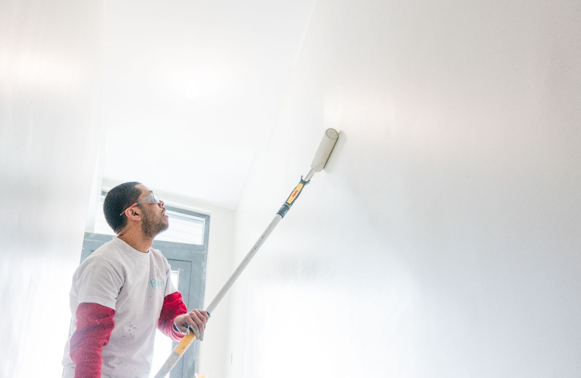
Outdoor Painting Temperatures and Curing Time


Most high-quality exterior paints have an ideal temperature range for application, usually between 10°C and 30°C. Outside of this window, paint won’t cure properly—leading to reduced durability and an increased chance of peeling or flaking. In Saskatoon, this optimal range is fleeting. Booking your project too late in the season can mean rushing the work or risking a finished product that simply won’t last. Planning ahead ensures you’re painting when conditions are just right.


The Financial Risks of Delaying Your Project


Putting off repainting might seem like a way to save money in the short term, but the reality is often the opposite.


Increased Labor and Material Costs Over Time


As paint deteriorates, so does the surface underneath. Wood swells and decays, metal rusts, and stucco or siding can develop deep cracks. These issues don’t just look bad—they make the prep work for the next paint job more complicated and ex

pensive. Instead of a straightforward wash and paint, you might be facing major scraping, sanding, priming, and even repairs.

Worse, inflation and supply chain fluctuations can cause paint and labor costs to rise—sometimes dramatically—between seasons. Waiting another year might mean paying significantly more for the exact same job.


Emergency Repairs Cost More than Planned Maintenance


When paint fails, it’s not just an aesthetic issue. Water can seep into unprotected areas, causing rot, mold, or even structural damage. When that happens, you’re looking at emergency repairs—work that is always more expensive, disruptive, and time-consuming than planned preventative maintenance. Calling Revive Painting for a scheduled, well-prepared project is always less expensive than calling us in a panic after the spring melt reveals extensive water damage.


Loss of Early Booking Discounts


Painting contractors often offer discounts for early season bookings, especially for larger projects like apartment exteriors. You might secure a better price, guaranteed timelines, or even added value like complimentary surface repairs or pressure washing. If you wait until peak season, these incentives are long gone, and you may even see a premium for last-minute scheduling or after-hours work.


Tenant Experience and Property Reputation


The condition of your building’s exterior affects far more than just the ledger sheet—it shapes your tenants’ experiences and your property’s reputation in the community.


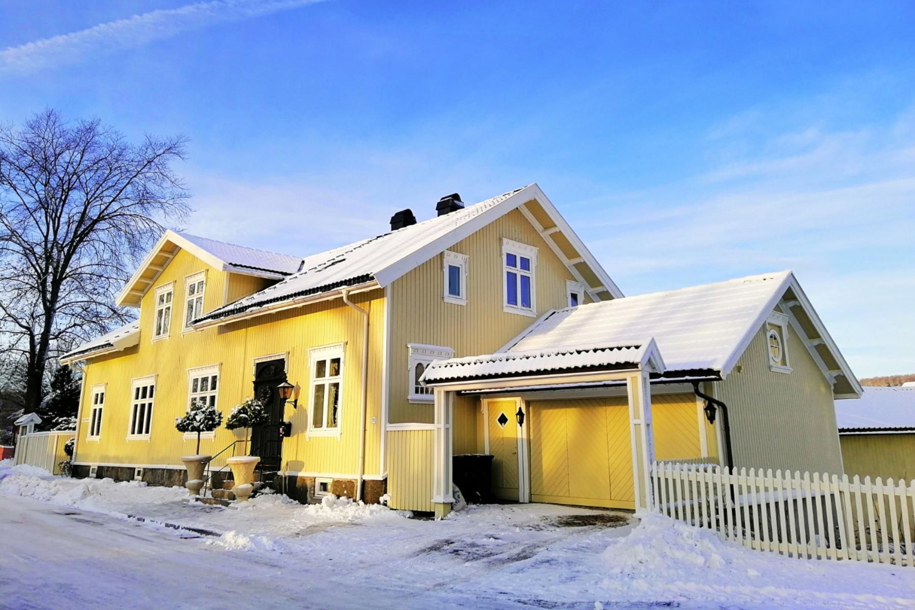
Peeling or Faded Paint Affects Curb Appeal


Curb appeal isn’t just a buzzword—it’s what drives walk-ins, recommendations, and digital listings. Faded, peeling paint sends a message of neglect to renters, visitors, and passersby alike. Prospective tenants are far less likely to contact you for a showing, and your current tenants may start thinking about moving elsewhere. When your building consistently looks fresh and well-cared for, it stands out for the right reasons.


Unplanned Painting Disrupts Tenant Routines


No one likes surprises, especially tenants. When painting is rushed or scheduled last-minute due to emergency needs, residents face unexpected noise, blocked entrances, and logistical headaches—sometimes for weeks at a time. Clear communication and advance notice help tenants prepare, making the process less stressful for all parties. Plan ahead, and you can coordinate with tenants to minimize disruption and maintain goodwill.


Well-Maintained Exteriors Attract Better Tenants


The best tenants—those who pay on time, stay longer, and take care of their units—gravitate to buildings where pride of ownership is evident. Well-maintained exteriors are an outward sign of responsible management, which in turn attracts respectful residents. Regular painting isn’t just about preventing complaints; it’s about creating a community people want to be part of.


Planning Ahead for a Smooth Project


If you want the best results for your apartment complex, it’s worth investing a little time upfront to ensure everything goes smoothly from start to finish.


Coordinating with Property Management and Tenants


Start by working with your property management team to develop a communication plan. Notify tenants of impending work, set clear timelines, and provide guidance on how to prepare balconies, patios, or parking stalls. With the right notice and transparency, you’ll minimize frustration and build trust.


Allowing Time for Surface Prep and Repairs


After an initial estimate, skilled painters will assess the building for any needed repairs—cracks, rotten wood, rust, or mildew. Addressing these before painting ensures that the paint job won’t just look good, but will also last longer. Rushed or last-minute projects sacrifice this critical preparation, which is why early planning is so important.


Booking During Optimal Temperature for Painting Outside


In Saskatoon, optimal painting windows can close quickly. Booking your project with a reputable local company like Revive Painting in advance ensures you’re scheduled during the most favorable conditions possible. We know our climate and can schedule your project so it’s done right, with minimal risk of weather-related setbacks.


Fixing Your Complex


The exterior of your apartment building isn’t just “the face” of your investment—it’s its first line of defense, the foundation for tenant satisfaction, and, ultimately, a key driver of your property’s financial performance. Delaying exterior painting isn’t saving you time or money; it’s setting the stage for bigger headaches down the road.

At Revive Painting, we’ve watched too many Saskatoon apartment owners pay the price for waiting too long. Don’t let the same happen to you. Plan your exterior painting project before it’s too late, and you’ll enjoy lower costs, better tenant experiences, and a property that stands as a point of pride for years to come.

Ready to discuss your apartment building’s painting needs? Contact Revive Painting today. Let’s plan ahead—your property and your residents will thank you.


painted house with undercoat
By Revive Painting April 25, 2025
A good-looking home exterior doesn’t come from just picking the right shade of paint . What’s underneath—and what seals it in—matters just as much. Layers like undercoats and topcoats do the heavy lifting, helping your exterior paint job hold up under heat, rain, snow, and time. These layers make the difference between a finish that flakes in two years and one that lasts for over a decade. Primers Ensuring Maximum Surface Adhesion for Lasting Finishes Primers act like double-sided tape for your house paint. They grip onto raw or previously painted surfaces while providing the perfect foundation for the topcoat to stick. Without primer, paint often peels, bubbles, or flakes far earlier than expected. This layer helps paint go on smoothly and hold tight, especially on porous or chalky surfaces. Whether the home’s exterior is wood, masonry, or even metal, primer creates a uniform surface that equalizes absorption. This means your chosen paint color looks even and rich across the entire wall. One good coat of primer gives your finish a solid starting point, making the end result look more professional and last much longer. Sealant Undercoats Guarding Against Moisture Penetration Water is paint’s silent enemy. Rain, humidity, and frost creep into tiny cracks, breaking down materials over time. Sealant undercoats are specifically designed to block this moisture from seeping in. By forming a water-resistant layer, they help prevent swelling, mildew, and early surface decay. Homes in wet or coastal climates especially benefit from this type of undercoat. It’s not just about preventing leaks—it’s about preserving the actual structure beneath the paint. Applied correctly, a sealant layer can protect your home’s bones as much as its face. This step often gets skipped, but it’s one of the most important if you want your paint job to stand the test of time. High-Opacity Base Layers Masking Surface Imperfections Not every exterior wall is flawless, and paint won’t magically hide dents or uneven texture. That’s where high-opacity base layers come in. These thick undercoats are great at covering up discoloration, patches, or uneven tones, creating a blank slate for your final color. They cut down on the number of topcoat layers you’ll need too. By hiding imperfections early, these base layers also make bold or light shades pop better. Whether you're going for a deep forest green or a bright coastal white, these undercoats help make sure what you see on the paint chip is what ends up on your wall. Plus, your finish looks smoother, sharper, and more put-together from a distance. Protective Topcoats Enhancing Weather Resistance and Longevity The topcoat is more than just the color you picked—it’s the armor that shields your home’s surface. Good topcoats are engineered to resist rain, wind, temperature swings, and even insects. They hold color, deflect moisture, and stand up to daily wear and tear from the environment. One quality topcoat can protect your home for years longer than a budget product. It acts like a barrier, not only sealing in the color but also repelling grime, dust, and pollution. Investing in the right topcoat ensures your exterior keeps its fresh look and doesn't require frequent repaints. Pigmentation Strategies for Optimal Fade Resistance Sunlight fades even the most vivid paints if they’re not made with the right pigment combinations. Smart pigmentation strategies pair strong color bases with UV-resilient compounds that keep the shade true over time. This is particularly important for bold colors that can quickly look washed out under strong sunlight. A good paint job balances pigment density with proper layering, ensuring the color holds its depth for years. You might not notice the science behind it, but you’ll appreciate it when your red stays red and your blue doesn’t turn gray. These formulations are tested to last through years of sun exposure without significant dulling. Elasticity in Topcoat Formulas Preventing Crack Formation Paint that doesn’t move will crack. That’s why flexibility matters. High-quality topcoats now include elastic ingredients that allow the paint film to stretch and contract as temperatures change. This flexibility prevents cracks from forming as materials naturally expand and shrink with the weather. Homes with older siding or settling structures benefit even more from this kind of paint. Elastic topcoats bridge small gaps, keeping water and pests out while maintaining a seamless appearance. Over time, this prevents the need for patching or full repainting due to splitting and flaking. Breathable Coatings Maintaining Structural Integrity A completely sealed wall might sound like a good thing—but not if it traps moisture inside. That’s where breathable coatings come in. They allow water vapor to escape while still blocking liquid water from getting in. This balance keeps your walls dry on the inside and well-protected on the outside. Breathable coatings reduce the risk of mold, mildew, and interior rot. They’re especially helpful for homes with older construction or materials that naturally hold moisture. This under-the-radar feature can extend the life of not only your paint but your siding, sheathing, and even insulation. UV-Resistant Finishes Preserving Exterior Color Vibrancy Direct sunlight can wreck a beautiful paint job in no time. UV rays break down pigments and binders, leading to faded, chalky surfaces. Finishes with UV resistance prevent this slow burn, locking in your color for the long haul and keeping your exterior looking crisp and clean. Whether you're painting a sunny front porch or a south-facing wall, UV protection in your finish keeps your paint looking as vibrant as the day it dried. It’s a small detail that makes a big difference, especially in areas that get a lot of direct exposure year-round. Revive Painting Brings Out the Best in Every Exterior with Precision, Protection, and Color That Lasts Your home’s paint deserves more than a brush and a wish. At Revive Painting, every project starts with a real understanding of your home’s surface, weather exposure, and style. From durable primers that hold tight to breathable sealants that protect deep inside, our work goes far beyond color. Our team takes each layer seriously, using only the highest-performing undercoats and topcoats to ensure a smooth finish that stays strong for years. We don't believe in shortcuts. Whether your house sits in the shade or faces direct sunlight, Revive Painting brings the tools and techniques to match your specific needs. Want that deep blue to stay rich season after season? We’ve got the fade-fighting topcoats to make it happen. Ready to finally fix that peeling back wall? We’ve got sealants and elasticity coatings that will outlast any storm. Contact us to schedule a consultation and get your exterior painting done right—from the first coat to the final brushstroke. Let Revive Painting show you how the right layers do more than cover—we protect, we enhance, and we revive your home’s entire look.
By Revive Painting April 18, 2025
A surprising 80% of potential clients make judgments about businesses based on their facility's appearance. The physical environment of an office relates directly to employee morale and affects work performance and well-being. Our commercial painting experience shows how smart color choices can revolutionize workplace dynamics. Research proves that colors trigger specific emotions and behaviors. Blue creates a calm and focused atmosphere, while yellow sparks creativity and optimism. A fresh coat of paint does more than brighten walls - it builds an inviting work environment that boosts employee morale, creativity, and efficiency. The numbers back this up: 89% of employees who work in wellness-focused companies report higher job satisfaction and involvement. This piece will show you how the right office paint colors can lift employee spirits and create a positive workplace atmosphere. You'll learn about choosing perfect colors for different office areas and understand why this simple update can boost your team's motivation and satisfaction. The science behind color and mood in the workplace Color does more than just make a workplace look good – it's a powerful tool that affects brain function, emotional responses, and employee morale. Our experience as commercial painting specialists has shown us how the right color choices can reshape the scene in office environments and change how people work. The science of color psychology teaches us fascinating lessons about paint selections and their effect on workplace atmosphere. How color affects the brain and behavior Our brains process color beyond just visual information – specific psychological and physiological responses get triggered. Research shows that colors do more than change our moods. They can substantially affect productivity levels and influence emotional responses. Our commercial painting experience lines up with scientific findings that show specific colors create predictable reactions in a variety of workplaces. Color psychology research has shown that different hues affect heart rate, blood pressure, and creative thinking abilities. The way we plan office painting projects takes into account how warm colors (red, orange, yellow) create different responses than cool colors (blue, green, purple). Studies have found that students exposed to red before exams perform worse, which shows how much color can affect cognitive function. People make quick judgments about their environment within 90 seconds, and color plays a major role. Research also shows that about 80% of people believe color directly affects their mood. We use this knowledge to create workplace color schemes that boost employee morale and wellbeing. Why certain hues promote calm, focus, or energy Science clearly shows that different colors create unique psychological and physiological effects that work best for various workplace functions. To cite an instance, blue spaces actually lower heart rate and blood pressure while helping people concentrate better. This explains why people working in blue and green offices report 33% less anxiety and 25% less fatigue than those in white or gray spaces. Research reveals that people working in spaces with warm, vibrant hues felt 20% more satisfied overall compared to those in muted environments. But balance matters – bright red spaces can trigger physical responses like faster heart rates and breathing, which might create stress over time. Our office color scheme planning takes these proven scientific effects into account: Blue tones – Create calm, reduce stress, help people focus and concentrate better Green shades – Balance mind and body, lower anxiety, let staff work longer without tired eyes Red accents – Create urgency, determination, and quick decisions (best used much of either) Yellow elements – Help creativity, optimism, and memory through better attention We boost employee morale through commercial painting by understanding that lavender represents hope and new beginnings. Teams working in blue and green spaces expressed 15% better focus and cooperative behavior. The right colors in the right places create environments where employees feel less stressed, more creative, and more satisfied overall. Choosing the right colors for different office zones The modern workplace isn't a one-size-fits-all environment, especially with color selection. At Revive Painting, we found that there was a direct link between workspace colors and employee morale and improved productivity . Our commercial painting experience shows that office areas serve different purposes. Some areas just need focus, others require creativity, while certain zones should promote relaxation. The right colors in these zones create environments that support your team's diverse needs throughout the workday. Focus areas: calming tones for deep work Neutral shades work best in spaces meant for concentration and deep work. They minimize distractions and help maintain attention. Soft grays, off-whites, and beiges create calm environments where employees can focus. These colors reduce visual stimulation and let employees channel their mental energy toward complex tasks. Blues prove substantially effective in focus areas. Research shows they boost concentration, stimulate thinking, and provide mental clarity. Electric blues create a balanced environment where people stay focused without feeling overwhelmed. Our commercial painting projects often feature colors like Palladian Blue or Constellation AF-540. Studies show these colors can reduce anxiety by 33% and decrease fatigue by 25% compared to white or gray spaces. Green stands out as another excellent choice where employees work long hours. It helps reduce eye fatigue over long workdays and promotes balance and concentration. These qualities make it perfect for offices that require both mental clarity and stress reduction. Colors like Guilford Green or Terrapin Green help employees stay productive without the visual fatigue that often comes with extended periods of concentration. Creative spaces: energizing colors for idea flow Collaborative spaces and innovation areas benefit from vibrant colors that spark creativity and encourage team interactions. Bright colors like yellow, orange, and turquoise make brainstorming sessions more dynamic. These stimulating hues can turn regular meetings into productive idea-generation sessions. Yellow brings sunshine and positivity to any space. It radiates optimism and creativity. We've seen how yellow in collaborative spaces creates an energetic atmosphere that encourages co-creation. Orange boosts innovation and problem-solving abilities, making it ideal for high-energy meeting rooms and brainstorming areas. Red packs power but requires careful use. This bold color signals power and excitement. It makes employees feel more active and energized. However, red works best when used much of either in creative zones to avoid overstimulation. We often combine energizing colors with cooler tones to create balanced environments that promote both creativity and focus while boosting employee morale. Break rooms: soothing shades for relaxation Break rooms should offer a peaceful escape from busy workdays. We pick colors that help employees disconnect and recharge. Blues, greens, whites, and neutral colors help people rest and relax. Light blue creates peace and serenity while giving the feel of open spaces like oceans or blue skies. Our largest longitudinal study shows that soothing lavender shades—popular in spas—work well in relaxation rooms. These colors tell employees it's time to unwind and rejuvenate. Green's calming effects reduce stress and promote comfort. A break room painted in soft green or blue stands apart from other office areas and creates an atmosphere for genuine relaxation. Thoughtful color selection in different office zones helps create environments that support various workplace activities. This approach to commercial painting not only makes your office look better but also substantially improves employee morale and workplace satisfaction. How fresh paint improves morale and motivation A fresh coat of paint does more than brighten walls at Revive Painting—it breathes new life into the entire workplace atmosphere. Our experience shows that office space updates create deep psychological benefits that affect employee morale. Research backs this up: the visual appeal of workspaces directly shapes how employees feel and perform. Fresh paint remains one of the most economical ways to boost workplace satisfaction. Visual refresh and its psychological impact Our office painting projects bring an immediate boost to employee mood and energy. This isn't just what we think—studies prove that a well-laid-out, appealing office improves employees' psychological well-being . It cuts down stress and lifts overall mood. Years of commercial painting have taught us that carefully chosen colors can spark breakthroughs. Dull, uninspiring spaces tend to hold back creativity. New paint brings lasting psychological benefits. Research shows office esthetics shape employee happiness, productivity, and teamwork. Every time we refresh an office space, we create an environment that supports positive mental states. Our clients tell us their teams show higher motivation and participation after painting projects. This matches research findings: happy surroundings make employees more driven and committed to their work. Cleanliness and pride in the workspace A newly painted office shows that leadership cares about their team's environment. Clean, well-kept walls create a professional look and prove that the company values its space and people. Commercial painting projects have shown us how this investment encourages loyalty among staff members. Clean spaces help people focus better and work more efficiently. After we finish painting, the new tidiness helps employees channel their energy toward real work instead of getting distracted by worn-out surroundings. Teams take more pride in fresh spaces, which builds their sense of belonging. Studies confirm that proud employees keep their workplace clean and organized. This creates an ongoing cycle that keeps lifting team spirit. A pristine workspace after professional painting clearly shows that employees matter. It highlights the company's dedication to their comfort and productivity. Each commercial painting project helps us create spaces where teams can grow both mentally and professionally. Creating a sense of belonging through color and design Brand colors in workspace design take office painting beyond simple esthetics. Companies that incorporate their brand colors into office spaces create powerful psychological connections between employees and their workplace. Research shows that a well-branded office boosts employee participation, productivity, and job satisfaction by promoting a positive atmosphere where teams perform their best. Using brand colors to reinforce identity Commercial painting projects need careful assessment of how a company's color palette strengthens its organizational identity. Brand colors should reflect your company's core values—whether that's innovation, trust, creativity, or stability—and create environments that support these qualities in your team. Offices that combine brand colors into their design create immediate recognition and familiarity, helping employees connect with the company's mission. The right balance is vital. Companies with branding colors that might not optimize workplace wellbeing (such as predominantly red schemes) should use complementary colors in primary work areas. Brand consistency can stay intact in reception zones and meeting rooms. This approach will give a solid brand identity without affecting employee morale or productivity. How color consistency builds team unity Teams develop stronger connections and pride in their organizational identity when colors remain consistent throughout the office. Research confirms this effect. Offices with smart color implementation create stronger team bonds by reinforcing company values at every turn. Office color schemes need these key elements to build unity: Strategic placement – Brand colors in wall designs, furniture, and artwork boost recognition while keeping employees inspired Visual harmony – A cohesive palette creates balanced environments where brand colors complement rather than overwhelm Functional adaptation – Color intensity adjusts based on zone purpose while maintaining brand consistency Companies have discovered how color consistency builds belonging recently. Smart organizations know that well-painted environments with brand colors create spaces where employees feel connected to their company's identity and purpose. Our approach to painting offices for employee well-being The way workplace environments affect employee well-being shapes our systematic approach to commercial painting projects. Our strategies improve both esthetics and employee morale through careful planning, backed by extensive color psychology research and years of hands-on experience. How we plan color schemes with productivity in mind Our color selection process starts by understanding your workplace functions and what your employees need. Studies show that workspaces with blues and greens helped employees become 20% more creative and 33% more satisfied overall. These numbers guide us to analyze workplace traffic patterns, lighting conditions, and each zone's main purpose before we suggest color schemes. We create a custom color plan based on your organizational culture and work needs during our first meeting. Colors affect different work environments in unique ways, and we know one size doesn't fit all. To name just one example, we recommend blues or greens for spaces where employees need to focus for long periods because research shows these colors help reduce eye strain during long workdays. Creative zones need different treatment - we add energizing colors that spark ideas without overwhelming people. Minimizing disruption during painting projects Business continuity stays our top priority while we paint. We work around your business schedule and offer flexible options like after-hours painting, weekend work, or staged approaches. Your workplace can stay functional throughout the project. This careful planning helps keep productivity high while we change your workspace. We use several proven strategies to reduce disruption when we must work during business hours. Our staged approach breaks down the project into smaller sections. This means only small areas of your workspace face disruption at once. We also use quick-drying, low-odor paints so your employees can return to freshly painted areas faster. Your team stays informed about timelines, affected areas, and completion dates throughout the process, which helps everyone adjust their routines. Using safe, low-VOC paints for healthier air Employee health guides our choice of materials. We use low and zero-VOC paints that release fewer harmful emissions than traditional paints. Traditional paint's volatile organic compounds can cause headaches, nausea, and breathing problems – these issues directly affect how your employees feel and work. We choose paints that go beyond the strictest industry standards because we care about environmental responsibility. The benefits are clear – well-ventilated spaces with low-VOC paints reduce indoor air pollution, which causes 3.8 million deaths worldwide each year. These healthier paint options support your team's long-term well-being by eliminating the continuous off-gassing that conventional paints produce for years. Our comprehensive approach to office painting creates environments where your team can excel. Finding the Best Commercial Painter in Saskatoon to Boost Workplace Morale Our commercial painting experience has taught us how the right office colors can revolutionize workplace dynamics and lift employee morale. Studies prove that smart color choices create environments where teams thrive. Calming blues boost focus while energizing yellows fuel creativity. The careful blend of brand colors builds organizational identity and creates the perfect balance needed for workplace wellness. We've seen it in countless office painting projects - employees in well-designed color environments are much more satisfied and engaged with their work. Color psychology might seem daunting, but our expertise helps businesses create spaces that support their team's varied needs. Break rooms with soothing greens and focus areas with concentration-boosting blues show how each shade plays its part in supporting employee wellbeing. Professional office painting delivers benefits that go way beyond looks. Clean, fresh walls with safe, low-VOC paints show a company's dedication to its people and create healthier workspaces. Our smart approach to picking and applying colors helps businesses build environments where employees feel valued, motivated, and connected. Companies that invest in thoughtful office design through professional painting see returns through better team morale, increased efficiency, and a stronger organizational culture. FAQs Q1. How does color affect productivity in the workplace? Different colors can significantly impact workplace productivity. Blue is known to enhance focus and efficiency, while yellow can boost creativity and optimism. Green promotes balance and reduces eye fatigue, making it ideal for long work sessions. The key is to choose colors that align with the specific needs of each workspace. Q2. Why is incorporating brand colors into office design important? Using brand colors in office design reinforces company identity and creates a sense of belonging among employees. It helps build a stronger connection between staff and the organization's mission, potentially leading to increased engagement and job satisfaction. However, it's crucial to balance brand colors with those that optimize workplace well-being. Q3. What are the benefits of using low-VOC paints in office spaces? Low-VOC paints significantly reduce harmful emissions, creating a healthier work environment. They minimize the risk of headaches, nausea, and respiratory problems often associated with traditional paints. Using these environmentally responsible products can improve indoor air quality, contributing to better long-term employee health and well-being. Q4. How can different office zones be color-coded for maximum effectiveness? Different areas of an office can be color-coded to support various functions. For focus areas, calming blues or greens can enhance concentration. Creative spaces benefit from energizing colors like yellow or orange to stimulate idea flow. Break rooms should use soothing shades like light blue or lavender to promote relaxation and stress relief. Q5. What impact does a fresh paint job have on employee morale? A fresh paint job can significantly boost employee morale. It creates a clean, professional appearance that shows the company values its workspace and employees. This visual refresh can lead to increased motivation, engagement, and pride in the workplace. Employees often report feeling more valued and energized in a newly painted environment, which can translate to improved job satisfaction and productivity.