The Hidden Costs of Ignoring 2025's Commercial Painting Trends

Revive Painting • February 23, 2025
hotel lobby repaint

Colours have remarkable power in commercial spaces. They directly influence customer behavior, employee efficiency, and business success. The commercial painting landscape shows a fundamental change toward eco-conscious and wellness-focused color choices as we approach 2025. This makes a commercial painter's role more significant than ever.


Modern commercial painters adapt their techniques to include earthy tones, biophilic designs, and metallic accents. These choices represent more than decoration - they are strategic business decisions. My research for local commercial painters revealed an interesting trend. Businesses that ignore current painting trends risk more than their esthetic appeal. The consequences can be severe - from lower property values to missed business opportunities and reduced customer participation.


This piece explores what it all means when businesses neglect 2025's commercial painting trends. Your business's success depends on staying current with these changes.


Understanding Modern Commercial Paint Trends


The commercial painting industry faces major changes as we enter 2025. These changes are reshaping how businesses make their esthetic decisions. The paint and coatings market will reach CAD 249.97 billion by 2025, with a steady CAGR of 4.0%.


Current market expectations


Sterile whites and cool grays no longer dominate office spaces. Earth-inspired colors have become 2025's standout trend, especially those in the green family. Green environments reduce eye strain by 45% and lower stress levels by 30%. Creative thinking improves by 20% in these spaces.


The architectural segment leads growth in the paints and coatings market. Companies now understand that careful color selection affects employee productivity and customer behavior. Strategic color choices boost employee productivity by up to 15% and increase customer dwell time by 20%.


Impact on business perception


Commercial buildings' exterior appearance creates the first impression on potential customers. Professional commercial painters create environments that attract customers and encourage them to return. Market projections show the paint and coatings sector will reach CAD 114.10 billion by 2029, growing at 6.6% annually.


Colour alone influences 90% of quick decisions about products. Commercial paint colour selection affects purchasing intent and shapes customer perception of brand personality. The construction paints and coatings sector will grow from CAD 83.82 billion in 2024 to CAD 88.28 billion in 2025.


Warm neutrals lead the 2025 trends. These colors offer timeless elegance for professional settings and sophisticated alternatives to traditional white and gray. They provide better depth and dimension while maintaining brand consistency across locations. Professional commercial painting services extend paint life up to 7 years. They also reduce maintenance costs and improve brand perception.

Eco-friendly and wellness-focused color choices continue to grow popular. The industry adapts to these changing priorities through technological advancements and increased research for performance improvements.


Financial Impact on Business Operations


Your business operations take a big hit when you ignore commercial painting trends. Studies show that outdated or poorly managed commercial spaces directly affect your financial performance.


Decreased customer engagement


First impressions shape how customers behave. Businesses that keep their exteriors in good shape see more repeat customers. A professional paint job draws more people and makes them stay longer. Retail spaces with modern paint schemes have seen their sales jump by 20%.


Lower employee productivity


Your workspace environment shapes how well your employees perform. A newer study, published by the University of Texas found that dull gray, beige, and white offices make people feel sad and depressed, especially women. Men's mood and productivity drop in purple and orange spaces. Blue and green spaces, on the other hand, help people work better. Employees feel less stressed and like their jobs more in these colors.


Maintenance cost escalation


Your costs will climb if you put off regular painting maintenance. Commercial painters charge between CAD 83.60 to CAD 139.34 per hour. Delayed maintenance often means bigger repairs. Simple painting supplies cost CAD 69.67 to CAD 209.00, while support equipment might add CAD 696.68 to CAD 2090.04+ per day.


Paint quality makes a big difference in long-term costs. Premium paints cost CAD 69.67 to CAD 104.50 per gallon but give better protection and last longer. Regular maintenance prevents expensive structural damage, cuts down major repaints, and makes buildings more energy-efficient through better sealing.


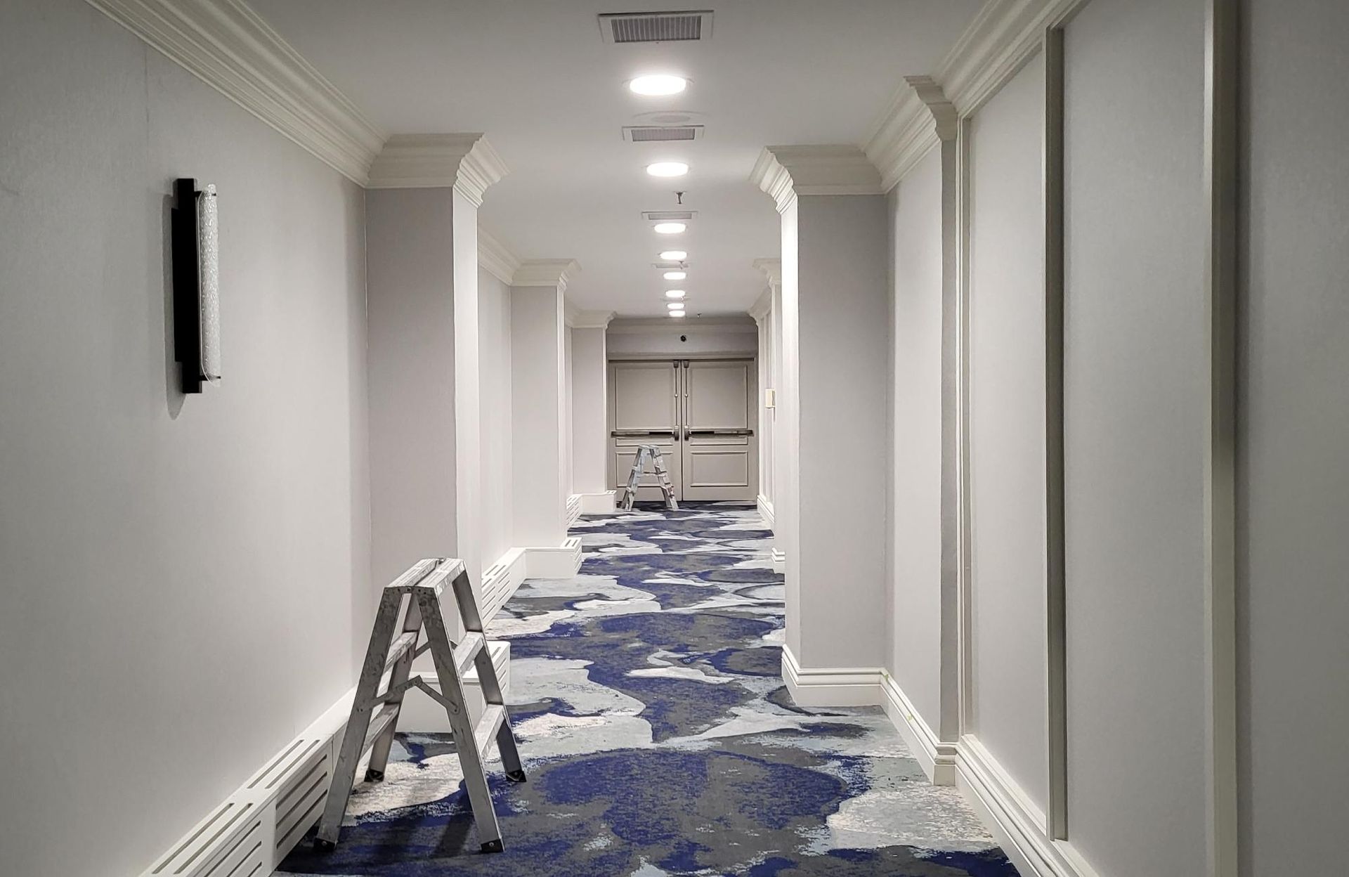
Working with experienced commercial painters is a vital part of protecting your property value and keeping operations smooth. Professional crews can work after hours or on weekends to minimize disruption. This smart approach to maintenance keeps your building looking good and saves money through preventive care.


Market Position and Competition


Physical appearance significantly shapes how customers view businesses and impacts their success. Studies show that paint choices inside and outside a building directly affect customer trust, loyalty, and buying decisions.


Brand image deterioration


A building's look works as a powerful marketing tool that communicates brand values to potential customers. Research shows that clean, vibrant, and properly managed properties signal professionalism and care for detail. Faded colors and chipped paint make customers think of neglect.


Commercial painters know that using consistent color schemes helps strengthen brand recognition. Businesses that don't take care of their physical spaces risk damaging their brand's visual identity. Research proves that customers quickly judge product quality based on how a facility looks, and well-kept exteriors bring in more visitors.


Lost business opportunities


The commercial painting sector keeps growing, but many businesses still look outdated. The global antimicrobial coatings market reached USD 11.39 billion in 2023 and should grow by 13.9% from 2024 to 2030. These numbers show rising demand for specialized paint solutions that improve both looks and function.


Professional commercial painters now provide state-of-the-art solutions like self-healing paints and VOC-free compounds. These new products last longer and make indoor air cleaner. Businesses that don't use these technologies risk falling behind their competitors who welcome such improvements.


Construction and real estate sectors continue to grow steadily, giving businesses chances to stand out. Companies with old paint schemes often see fewer customers and lose revenue. Local commercial painters report that businesses who invest in regular upkeep and modern paint solutions get happier customers and more referrals.


The painting industry expects more advances in materials and techniques. Smart businesses that work with experienced commercial spray painters put themselves in a great position. They can make use of these improvements and keep their spaces welcoming and competitive as markets change.


Property Value Implications


Paint choices do more than just make a property look good - they affect its value and shape long-term financial plans. Market analysis shows clear links between color choices and property worth.


Depreciation factors


Paint inside buildings loses 8.33% of its value each year. Smart color choices are vital to keep property values stable. Zillow's research shows how colors can affect a property's worth by a lot. Their data reveals that blue-gray kitchens sold for CAD 2,508.05 more than other colors. Light blue bathrooms brought in CAD 7,579.88 above expected prices.


Location plays a key role in how fast paint wears down. Local commercial painters highlight how the environment affects paint life. Paint deteriorates faster in areas with high pollution, humidity, or harsh weather. Premium materials make sense in these spots, even though they cost more upfront.


Future renovation expenses


Property experts predict higher material costs in 2025, with 70% expecting price increases. A typical mid-sized commercial paint job covering 10,000 square feet costs between CAD 27,867.20 and CAD 83,601.61. These prices include labor, materials, and other needs.

Commercial painters know that delayed maintenance leads to bigger repair bills later. Paint lasts longer when surfaces are prepared well, with proper primer and technique. White spaces, once seen as a safe choice, now might suggest poor maintenance and bring lower offers.


Construction faces big challenges today. Land costs hit record highs, banks restrict lending, and city approvals take longer. Smart businesses team up with experienced painters to create detailed maintenance plans. This helps properties keep their value despite tough market conditions.


FAQs


Q1. How do commercial painting trends impact business success? Commercial painting trends significantly influence customer behavior, employee productivity, and overall business success. Strategic color choices can increase sales by up to 20%, improve employee productivity by 15%, and enhance customer engagement.

Q2. What are the financial consequences of ignoring current painting trends? Ignoring current painting trends can lead to decreased customer engagement, lower employee productivity, and increased maintenance costs. It may also result in brand image deterioration and lost business opportunities, ultimately affecting the company's bottom line.

Q3. How does paint quality affect long-term costs for businesses? While premium paints may have higher upfront costs, they offer superior protection and durability. Using high-quality paint can prevent expensive structural damage, reduce the frequency of major repaints, and improve energy efficiency through proper sealing, leading to long-term cost savings.

Q4. Can paint colors impact property value? Yes, paint colors can significantly impact property value. For example, blue-gray kitchens have been shown to command higher sales prices, while light blue bathrooms can fetch above-expected values. Conversely, outdated or poorly maintained paint can lead to property depreciation.

Q5. Why is it important to stay updated with commercial painting trends? Staying updated with commercial painting trends is crucial because it helps businesses maintain a competitive edge, attract customers, and create a positive work environment. It also ensures that the property maintains its value and avoids costly repairs or renovations in the future.


Wrapping It Up


Colour trends in commercial painting do more than just make buildings look good. Smart color choices can change customer behavior, improve employee output, and boost property values. Businesses that follow modern paint trends see their sales grow by up to 20% and get better customer participation.


Paint selections work as quiet brand representatives that showcase business values and precision. Quality paints and professional work need money upfront but prevent repairs from getting pricey later. Studies reveal that smart color picks can add thousands to property value, especially shades like blue-gray that give real returns.


Market research shows eco-friendly, wellness-focused paint choices are becoming the norm. Companies that ignore these changes risk falling behind rivals who know how colors affect customer choices. Professional painters now provide innovative solutions beyond basic painting to help businesses compete effectively.


Timing matters most in commercial painting projects. Delays often result in costly fixes, lower property values, and missed business chances. Smart owners team up with seasoned painters and create detailed maintenance plans to protect their investment while keeping up with trends. You should connect with a professional commercial painter to make your business space trendy and competitive.


Need help?


Let Revive Painting and Wall Coverings help!  Our painters know your business and operations - let us enhance it today.  Contact us to learn more.

Delta hotel commercial project Saskatoon
By Revive Painting April 18, 2025
A surprising 80% of potential clients make judgments about businesses based on their facility's appearance. The physical environment of an office relates directly to employee morale and affects work performance and well-being. Our commercial painting experience shows how smart color choices can revolutionize workplace dynamics. Research proves that colors trigger specific emotions and behaviors. Blue creates a calm and focused atmosphere, while yellow sparks creativity and optimism. A fresh coat of paint does more than brighten walls - it builds an inviting work environment that boosts employee morale, creativity, and efficiency. The numbers back this up: 89% of employees who work in wellness-focused companies report higher job satisfaction and involvement. This piece will show you how the right office paint colors can lift employee spirits and create a positive workplace atmosphere. You'll learn about choosing perfect colors for different office areas and understand why this simple update can boost your team's motivation and satisfaction. The science behind color and mood in the workplace Color does more than just make a workplace look good – it's a powerful tool that affects brain function, emotional responses, and employee morale. Our experience as commercial painting specialists has shown us how the right color choices can reshape the scene in office environments and change how people work. The science of color psychology teaches us fascinating lessons about paint selections and their effect on workplace atmosphere. How color affects the brain and behavior Our brains process color beyond just visual information – specific psychological and physiological responses get triggered. Research shows that colors do more than change our moods. They can substantially affect productivity levels and influence emotional responses. Our commercial painting experience lines up with scientific findings that show specific colors create predictable reactions in a variety of workplaces. Color psychology research has shown that different hues affect heart rate, blood pressure, and creative thinking abilities. The way we plan office painting projects takes into account how warm colors (red, orange, yellow) create different responses than cool colors (blue, green, purple). Studies have found that students exposed to red before exams perform worse, which shows how much color can affect cognitive function. People make quick judgments about their environment within 90 seconds, and color plays a major role. Research also shows that about 80% of people believe color directly affects their mood. We use this knowledge to create workplace color schemes that boost employee morale and wellbeing. Why certain hues promote calm, focus, or energy Science clearly shows that different colors create unique psychological and physiological effects that work best for various workplace functions. To cite an instance, blue spaces actually lower heart rate and blood pressure while helping people concentrate better. This explains why people working in blue and green offices report 33% less anxiety and 25% less fatigue than those in white or gray spaces. Research reveals that people working in spaces with warm, vibrant hues felt 20% more satisfied overall compared to those in muted environments. But balance matters – bright red spaces can trigger physical responses like faster heart rates and breathing, which might create stress over time. Our office color scheme planning takes these proven scientific effects into account: Blue tones – Create calm, reduce stress, help people focus and concentrate better Green shades – Balance mind and body, lower anxiety, let staff work longer without tired eyes Red accents – Create urgency, determination, and quick decisions (best used much of either) Yellow elements – Help creativity, optimism, and memory through better attention We boost employee morale through commercial painting by understanding that lavender represents hope and new beginnings. Teams working in blue and green spaces expressed 15% better focus and cooperative behavior. The right colors in the right places create environments where employees feel less stressed, more creative, and more satisfied overall. Choosing the right colors for different office zones The modern workplace isn't a one-size-fits-all environment, especially with color selection. At Revive Painting, we found that there was a direct link between workspace colors and employee morale and improved productivity . Our commercial painting experience shows that office areas serve different purposes. Some areas just need focus, others require creativity, while certain zones should promote relaxation. The right colors in these zones create environments that support your team's diverse needs throughout the workday. Focus areas: calming tones for deep work Neutral shades work best in spaces meant for concentration and deep work. They minimize distractions and help maintain attention. Soft grays, off-whites, and beiges create calm environments where employees can focus. These colors reduce visual stimulation and let employees channel their mental energy toward complex tasks. Blues prove substantially effective in focus areas. Research shows they boost concentration, stimulate thinking, and provide mental clarity. Electric blues create a balanced environment where people stay focused without feeling overwhelmed. Our commercial painting projects often feature colors like Palladian Blue or Constellation AF-540. Studies show these colors can reduce anxiety by 33% and decrease fatigue by 25% compared to white or gray spaces. Green stands out as another excellent choice where employees work long hours. It helps reduce eye fatigue over long workdays and promotes balance and concentration. These qualities make it perfect for offices that require both mental clarity and stress reduction. Colors like Guilford Green or Terrapin Green help employees stay productive without the visual fatigue that often comes with extended periods of concentration. Creative spaces: energizing colors for idea flow Collaborative spaces and innovation areas benefit from vibrant colors that spark creativity and encourage team interactions. Bright colors like yellow, orange, and turquoise make brainstorming sessions more dynamic. These stimulating hues can turn regular meetings into productive idea-generation sessions. Yellow brings sunshine and positivity to any space. It radiates optimism and creativity. We've seen how yellow in collaborative spaces creates an energetic atmosphere that encourages co-creation. Orange boosts innovation and problem-solving abilities, making it ideal for high-energy meeting rooms and brainstorming areas. Red packs power but requires careful use. This bold color signals power and excitement. It makes employees feel more active and energized. However, red works best when used much of either in creative zones to avoid overstimulation. We often combine energizing colors with cooler tones to create balanced environments that promote both creativity and focus while boosting employee morale. Break rooms: soothing shades for relaxation Break rooms should offer a peaceful escape from busy workdays. We pick colors that help employees disconnect and recharge. Blues, greens, whites, and neutral colors help people rest and relax. Light blue creates peace and serenity while giving the feel of open spaces like oceans or blue skies. Our largest longitudinal study shows that soothing lavender shades—popular in spas—work well in relaxation rooms. These colors tell employees it's time to unwind and rejuvenate. Green's calming effects reduce stress and promote comfort. A break room painted in soft green or blue stands apart from other office areas and creates an atmosphere for genuine relaxation. Thoughtful color selection in different office zones helps create environments that support various workplace activities. This approach to commercial painting not only makes your office look better but also substantially improves employee morale and workplace satisfaction. How fresh paint improves morale and motivation A fresh coat of paint does more than brighten walls at Revive Painting—it breathes new life into the entire workplace atmosphere. Our experience shows that office space updates create deep psychological benefits that affect employee morale. Research backs this up: the visual appeal of workspaces directly shapes how employees feel and perform. Fresh paint remains one of the most economical ways to boost workplace satisfaction. Visual refresh and its psychological impact Our office painting projects bring an immediate boost to employee mood and energy. This isn't just what we think—studies prove that a well-laid-out, appealing office improves employees' psychological well-being . It cuts down stress and lifts overall mood. Years of commercial painting have taught us that carefully chosen colors can spark breakthroughs. Dull, uninspiring spaces tend to hold back creativity. New paint brings lasting psychological benefits. Research shows office esthetics shape employee happiness, productivity, and teamwork. Every time we refresh an office space, we create an environment that supports positive mental states. Our clients tell us their teams show higher motivation and participation after painting projects. This matches research findings: happy surroundings make employees more driven and committed to their work. Cleanliness and pride in the workspace A newly painted office shows that leadership cares about their team's environment. Clean, well-kept walls create a professional look and prove that the company values its space and people. Commercial painting projects have shown us how this investment encourages loyalty among staff members. Clean spaces help people focus better and work more efficiently. After we finish painting, the new tidiness helps employees channel their energy toward real work instead of getting distracted by worn-out surroundings. Teams take more pride in fresh spaces, which builds their sense of belonging. Studies confirm that proud employees keep their workplace clean and organized. This creates an ongoing cycle that keeps lifting team spirit. A pristine workspace after professional painting clearly shows that employees matter. It highlights the company's dedication to their comfort and productivity. Each commercial painting project helps us create spaces where teams can grow both mentally and professionally. Creating a sense of belonging through color and design Brand colors in workspace design take office painting beyond simple esthetics. Companies that incorporate their brand colors into office spaces create powerful psychological connections between employees and their workplace. Research shows that a well-branded office boosts employee participation, productivity, and job satisfaction by promoting a positive atmosphere where teams perform their best. Using brand colors to reinforce identity Commercial painting projects need careful assessment of how a company's color palette strengthens its organizational identity. Brand colors should reflect your company's core values—whether that's innovation, trust, creativity, or stability—and create environments that support these qualities in your team. Offices that combine brand colors into their design create immediate recognition and familiarity, helping employees connect with the company's mission. The right balance is vital. Companies with branding colors that might not optimize workplace wellbeing (such as predominantly red schemes) should use complementary colors in primary work areas. Brand consistency can stay intact in reception zones and meeting rooms. This approach will give a solid brand identity without affecting employee morale or productivity. How color consistency builds team unity Teams develop stronger connections and pride in their organizational identity when colors remain consistent throughout the office. Research confirms this effect. Offices with smart color implementation create stronger team bonds by reinforcing company values at every turn. Office color schemes need these key elements to build unity: Strategic placement – Brand colors in wall designs, furniture, and artwork boost recognition while keeping employees inspired Visual harmony – A cohesive palette creates balanced environments where brand colors complement rather than overwhelm Functional adaptation – Color intensity adjusts based on zone purpose while maintaining brand consistency Companies have discovered how color consistency builds belonging recently. Smart organizations know that well-painted environments with brand colors create spaces where employees feel connected to their company's identity and purpose. Our approach to painting offices for employee well-being The way workplace environments affect employee well-being shapes our systematic approach to commercial painting projects. Our strategies improve both esthetics and employee morale through careful planning, backed by extensive color psychology research and years of hands-on experience. How we plan color schemes with productivity in mind Our color selection process starts by understanding your workplace functions and what your employees need. Studies show that workspaces with blues and greens helped employees become 20% more creative and 33% more satisfied overall. These numbers guide us to analyze workplace traffic patterns, lighting conditions, and each zone's main purpose before we suggest color schemes. We create a custom color plan based on your organizational culture and work needs during our first meeting. Colors affect different work environments in unique ways, and we know one size doesn't fit all. To name just one example, we recommend blues or greens for spaces where employees need to focus for long periods because research shows these colors help reduce eye strain during long workdays. Creative zones need different treatment - we add energizing colors that spark ideas without overwhelming people. Minimizing disruption during painting projects Business continuity stays our top priority while we paint. We work around your business schedule and offer flexible options like after-hours painting, weekend work, or staged approaches. Your workplace can stay functional throughout the project. This careful planning helps keep productivity high while we change your workspace. We use several proven strategies to reduce disruption when we must work during business hours. Our staged approach breaks down the project into smaller sections. This means only small areas of your workspace face disruption at once. We also use quick-drying, low-odor paints so your employees can return to freshly painted areas faster. Your team stays informed about timelines, affected areas, and completion dates throughout the process, which helps everyone adjust their routines. Using safe, low-VOC paints for healthier air Employee health guides our choice of materials. We use low and zero-VOC paints that release fewer harmful emissions than traditional paints. Traditional paint's volatile organic compounds can cause headaches, nausea, and breathing problems – these issues directly affect how your employees feel and work. We choose paints that go beyond the strictest industry standards because we care about environmental responsibility. The benefits are clear – well-ventilated spaces with low-VOC paints reduce indoor air pollution, which causes 3.8 million deaths worldwide each year. These healthier paint options support your team's long-term well-being by eliminating the continuous off-gassing that conventional paints produce for years. Our comprehensive approach to office painting creates environments where your team can excel. Finding the Best Commercial Painter in Saskatoon to Boost Workplace Morale Our commercial painting experience has taught us how the right office colors can revolutionize workplace dynamics and lift employee morale. Studies prove that smart color choices create environments where teams thrive. Calming blues boost focus while energizing yellows fuel creativity. The careful blend of brand colors builds organizational identity and creates the perfect balance needed for workplace wellness. We've seen it in countless office painting projects - employees in well-designed color environments are much more satisfied and engaged with their work. Color psychology might seem daunting, but our expertise helps businesses create spaces that support their team's varied needs. Break rooms with soothing greens and focus areas with concentration-boosting blues show how each shade plays its part in supporting employee wellbeing. Professional office painting delivers benefits that go way beyond looks. Clean, fresh walls with safe, low-VOC paints show a company's dedication to its people and create healthier workspaces. Our smart approach to picking and applying colors helps businesses build environments where employees feel valued, motivated, and connected. Companies that invest in thoughtful office design through professional painting see returns through better team morale, increased efficiency, and a stronger organizational culture. FAQs Q1. How does color affect productivity in the workplace? Different colors can significantly impact workplace productivity. Blue is known to enhance focus and efficiency, while yellow can boost creativity and optimism. Green promotes balance and reduces eye fatigue, making it ideal for long work sessions. The key is to choose colors that align with the specific needs of each workspace. Q2. Why is incorporating brand colors into office design important? Using brand colors in office design reinforces company identity and creates a sense of belonging among employees. It helps build a stronger connection between staff and the organization's mission, potentially leading to increased engagement and job satisfaction. However, it's crucial to balance brand colors with those that optimize workplace well-being. Q3. What are the benefits of using low-VOC paints in office spaces? Low-VOC paints significantly reduce harmful emissions, creating a healthier work environment. They minimize the risk of headaches, nausea, and respiratory problems often associated with traditional paints. Using these environmentally responsible products can improve indoor air quality, contributing to better long-term employee health and well-being. Q4. How can different office zones be color-coded for maximum effectiveness? Different areas of an office can be color-coded to support various functions. For focus areas, calming blues or greens can enhance concentration. Creative spaces benefit from energizing colors like yellow or orange to stimulate idea flow. Break rooms should use soothing shades like light blue or lavender to promote relaxation and stress relief. Q5. What impact does a fresh paint job have on employee morale? A fresh paint job can significantly boost employee morale. It creates a clean, professional appearance that shows the company values its workspace and employees. This visual refresh can lead to increased motivation, engagement, and pride in the workplace. Employees often report feeling more valued and energized in a newly painted environment, which can translate to improved job satisfaction and productivity.
By Revive Painting April 7, 2025
Choosing someone to paint your home might seem simple—but getting it done right takes more than picking a name off a list. A great painter doesn’t just slap color on a wall. They take their time, care about the details, and leave your place better than they found it. If you want the job to look amazing and last for years, finding the right painting contractor in Saskatoon matters more than you might think. Checking Past Projects to Gauge Quality and Craftsmanship A good way to see what a painter can do is to look at what they’ve already done. Ask for photos or check their website to find examples of finished projects. A clean, even finish and neat lines are signs of solid work. Try to find pictures of rooms or buildings that are similar to yours, so you can get a real idea of how the results might look in your space. Don’t stop at just looking. Ask if they have any past customers you can talk to or projects nearby that you can see in person. Hearing from someone else who hired them tells you a lot more than an ad ever could. When someone is proud of their work, they’ll be happy to show it off. Comparing Quotes Without Compromising on Value When you're collecting quotes, the cheapest one isn’t always the best choice. Sometimes a low price means they’re skipping steps or using cheaper materials. That might save money now, but it could mean touch-ups and repairs later. It's smarter to look at what’s included, not just the total number. Ask each contractor to break down the quote. What kind of paint are they using? Will they be prepping the walls properly? Are they covering furniture and cleaning up after? These details make a big difference in the end. A painter who explains everything clearly and doesn't rush you is more likely to care about doing the job right. Asking the Right Questions Before Signing a Contract Before you agree to anything, ask questions. A good contractor will be ready with answers. Find out how long they’ve been painting, how many people are on their team, and how long the job will take. Ask what happens if it rains or if they find damage under old paint—real professionals have a plan for surprises. Also, ask how they handle changes. Maybe you decide on a different color halfway through. Will there be extra costs? Do they charge for touch-ups later? Asking now helps you avoid headaches later. If they get annoyed by your questions, that’s a red flag. A good painting contractor in Saskatoon will want you to feel confident, not confused. Reading Local Reviews That Highlight Real-World Results Online reviews are like a peek into someone else’s experience. But don’t just look at the number of stars. Read the actual comments. What did people like—or not like? Look for reviews that mention details, like how clean the crew was, how long the project took, or how the house looked a year later. Try to find reviews from people in your area. If someone down the street had a great experience, that's a good sign. Plus, local painters rely on word-of-mouth, so they usually care more about doing a great job. A contractor with happy Saskatoon customers is worth your attention. Prioritizing Surface Prep and Finishing Techniques Painting isn’t just about the color—it’s about how the paint goes on. If the surface underneath isn’t cleaned and fixed first, even the best paint won’t last. Ask how they prep the walls. Do they fix cracks, sand rough spots, and clean the surface? If not, the paint might peel or bubble before the year is out. Finishing touches matter too. Sharp edges, no drips, and smooth coats show real skill. Great painters don’t rush to finish—they take time to do it properly. If a contractor seems too quick to start or wrap up, that might mean they’re cutting corners. A professional painter makes sure the surface is solid before they even open a paint can. Verifying Insurance and Licensing for Peace of Mind This part might not be exciting, but it’s really important. A licensed painter has met local rules for safety and quality. Insurance matters too—it protects your home and the workers if something goes wrong. You hope nothing does, of course, but it’s better to be covered just in case. Don’t just take their word for it. Ask for proof. Any legit contractor will gladly show their license and insurance papers. If they hesitate or avoid the topic, move on. You want someone who’s upfront and follows the rules—not someone who takes chances with your home. Looking for Painters Who Respect Your Time and Space Your home is your space, and anyone working inside should treat it with care. Ask how they keep the area clean and what they do at the end of each day. A good painter cleans up tools, protects furniture, and doesn’t leave a mess behind. That shows respect for your home and your schedule. Time matters too. If they say they'll show up at 8, they should be there at 8. Delays happen, but how they handle them tells you everything. Choose a contractor who keeps you updated and sticks to the plan. When a painter respects your time, the whole experience feels easier and more comfortable from start to finish. Revive Painting in Saskatoon Brings Trust, Skill, and Respect to Every Project When you're ready to turn those plain walls into something beautiful, Revive Painting is the name you can trust. From careful prep work to the final brushstroke, we treat your home like it’s our own. The team at Revive doesn’t cut corners. We arrive on time, explain every step, and leave behind smooth, fresh walls that look amazing for years to come. If you’re tired of guessing who to hire and want a crew that shows up, listens, and gets the job done right the first time, Revive Painting is ready to help. Whether it's one room or the whole house, you’ll see the difference right away—in our attitude, in our work, and in how we treat your space. Contact us today to schedule a free quote and see how Revive can bring new life to your home, one coat at a time. Your walls deserve better—and so do you.