Home Painting: Beyond Beige—How to Use Warm Taupes & Golden Hues for a Cozier Home
Choosing the Perfect Beige and Warm Taupe Paint Colours
Beige and warm taupe paint colours offer versatile neutral foundations that adapt to different lighting conditions and design styles. These colors range from creamy beiges with golden undertones to sophisticated greiges that blend gray and beige elements.
Understanding Beige, Greige, and Taupe
Beige paint colours contain warm undertones of yellow, gold, or red that create inviting spaces. These shades work particularly well in rooms with abundant natural light, where they develop a soft, sun-kissed appearance.
Greige combines gray and beige to produce a modern neutral that feels less traditional than pure beige. Greige paint colours offer more versatility in contemporary spaces while maintaining warmth through their beige undertones.
Taupe sits between brown and gray, often featuring subtle purple or green undertones. Warm taupe variants lean toward brown with hints of red or yellow, making them ideal for cozy atmospheres. Cool taupes incorporate more gray, which can feel less welcoming in spaces lacking natural light.
The key difference lies in undertones. We recommend testing paint samples on multiple walls and observing them throughout the day to see how lighting affects each shade's appearance.
Popular Warm Beige and Taupe Paint Colours
Sherwin Williams Accessible Beige stands as one of the most popular neutral paint colors. This warm beige strikes a balance between beige and taupe, making it adaptable to various design styles.
Benjamin Moore Edgecomb Gray offers a greige option with warm undertones that shift between beige and gray depending on lighting. Revere Pewter provides another greige alternative with slightly cooler tones.
For true warm beiges, we recommend:
- Sherwin Williams Balanced Beige - warm versatile shade
- Benjamin Moore Manchester Tan - rich creamy beige
- Sherwin Williams Kilim Beige - warm with golden undertones
- Benjamin Moore Shaker Beige - soft traditional beige
Sherwin Williams Perfect Greige delivers exactly what its name suggests. Bungalow Beige, Wool Skein, and Grant Beige offer warmer alternatives, while Muslin and Sherwin Williams Natural Linen provide softer, fabric-inspired neutrals.
Nomadic Desert brings earthy warmth for those seeking richer tones.
Best Paint Colors for a Cozy Home Atmosphere
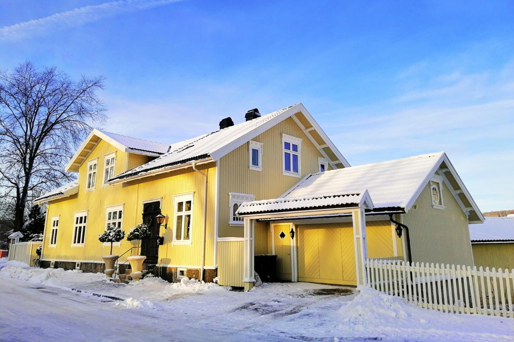
Warm beige paint creates cozy sanctuaries by reflecting light softly while maintaining depth. Colors with golden or yellow undertones enhance this effect, particularly in living rooms and bedrooms where relaxation matters most.
Accessible Beige and Balanced Beige work well in spaces with moderate to high natural light. These best beige paint colors pair beautifully with natural wood elements and earthy decor.
For rooms with less light, we suggest Manchester Tan or Kilim Beige. Their stronger warm undertones prevent spaces from feeling dull or flat. Edgecomb Gray suits modern homes seeking warmth without traditional beige appearance. The greige paint color adapts to different lighting while maintaining a welcoming feel.
Layer these neutral paint colors with textured fabrics, plants, and warm wood tones to maximize coziness. The best beige paint colors serve as foundations that let other design elements shine while providing consistent warmth throughout your home.
Making Your Home Feel Cozy and Inviting
Creating a cozy home starts with selecting paint colors that provide warmth and versatility, then enhancing those choices with thoughtful decor, proper testing, and an understanding of how light affects your space.
Creating a Neutral Backdrop for Every Room
We've found that the best neutral paint colors create a foundation that works throughout your entire home. A neutral backdrop allows us to change decor without repainting, saving time and money.
When choosing neutrals, we need to consider the undertones. Warm beige paint colors with golden or yellow undertones create inviting spaces, while warm grays offer a modern feel without coldness. The key is understanding what "neutral" means for your specific style.
The most versatile neutral backdrops include:
- Beige with subtle gray undertones for balanced warmth
- Warm grays that lean slightly beige rather than blue
- Natural linen tones that mimic organic textures
- Greige colors that blend the best of both worlds
We recommend using LRV (Light Reflectance Value) to understand how bright or dark a color will appear. Colors with an LRV of 50-60 provide enough depth without making rooms feel heavy. The beauty of a neutral backdrop is its flexibility. We can pair it with sage green accents for a natural vibe or add rich wood tones for traditional warmth.
Using Warm Golden and Earthy Hues
Warm golden and earthy hues instantly transform rooms into welcoming retreats. These colors work because they mimic natural elements like sunlight, sand, and clay. We love using beige undertones with hints of gold or honey. These shades catch natural light beautifully, creating a gentle glow throughout the day. Unlike cool neutrals, warm beige paint makes spaces feel lived-in and comfortable. Earthy tones in the brown family ground a room. We can use them as accent walls or throughout entire spaces for maximum coziness. Terracotta, warm tan, and soft caramel all fall into this category.
Consider these combinations:
- Golden beige walls with cream trim
- Warm taupe throughout with white ceilings
- Earthy brown accent wall with lighter beige surrounding walls
Color trends come and go, but warm earth tones remain timeless. They've been popular for decades because they create the emotional response we want in our homes.
Cozy Home Decor Pairings and Accents
Our paint colors work best when we pair them with complementary decor. Natural materials enhance the warmth of beige and taupe walls. Wood furniture in medium to dark tones creates beautiful contrast against warm neutrals. Oak, walnut, and cherry all bring out the golden undertones in our paint choices. We also love natural linen curtains and upholstery, which add texture without competing visually.
Metal finishes matter too. Brass, gold, and warm bronze hardware look stunning against warm beige paint and taupe walls. These finishes reflect light and add subtle luxury.
Our favorite accent combinations:
- Sage green pillows and throws against warm beige
- Cream and ivory textiles for a layered neutral look
- Deep navy or forest green as bold contrast colors
- Natural fiber rugs in jute or sisal
We can also add cozy elements through lighting. Warm-toned bulbs (2700K-3000K) enhance golden hues in paint, while table lamps with fabric shades create pools of soft light.
Testing Paint Samples and Considering Lighting
We never skip testing paint samples before committing to a full room. Colors look completely different on walls than they do on small chips. Paint large samples (at least 2x2 feet) directly on your walls. We observe them for at least 48 hours, checking how they look in morning light, afternoon sun, and evening artificial light. This reveals the true character of beige undertones and how warm grays shift throughout the day. North-facing rooms receive cooler light, which can make warm beige paint appear more gray. South-facing rooms get warm, direct light that intensifies golden tones. We adjust our color choices based on these conditions.
Our testing checklist includes:
| Factor | What to Check |
|---|---|
| Morning light | Does the color feel too cool or warm? |
| Afternoon light | Do undertones shift noticeably? |
| Artificial light | How do evening lamps affect the color? |
| Adjacent rooms | Does the color flow well with connecting spaces? |
We also test gray paint colors alongside our beige options. Sometimes what we think we want changes when we see actual samples in our specific lighting conditions.