Free Colour Consultations For Your Home With Every Paint Project

Revive Painting • November 15, 2025

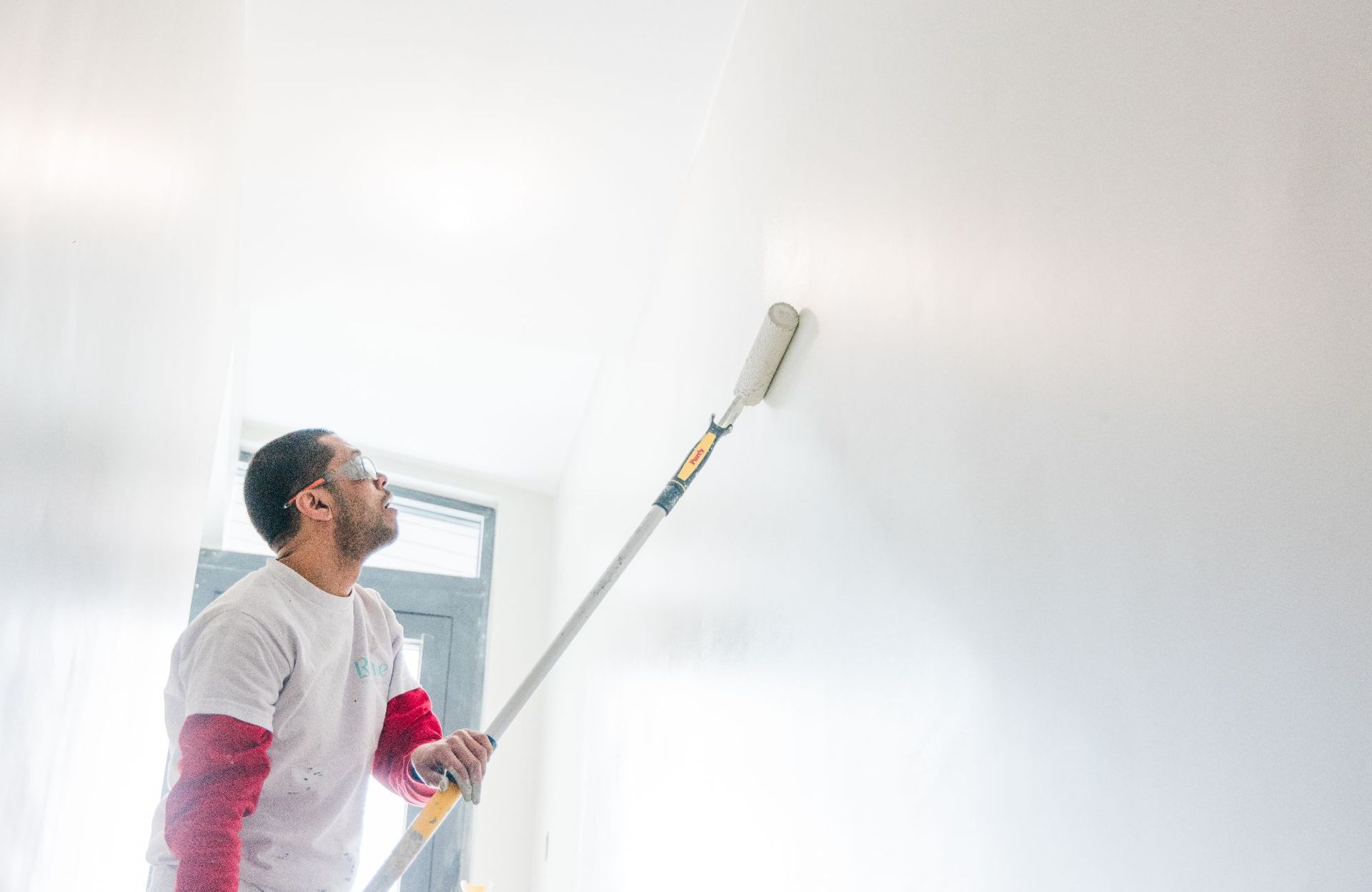
Picking the perfect paint colors for your walls shouldn't stress you out. Our Saskatoon painting company offers a completely free color consultation with every interior painting project we handle. This service goes beyond a quick chat or simple advice. You'll get a complete service that takes away all the guesswork from your color selection.


Most homeowners who pick wall paint colors alone often face costly mistakes and letdowns. Our professional color consultation eliminates these risks. Our expert consultants will get a full picture of your space and study all the factors that affect how colors look after application. Your final choice will match your vision and make your space look stunning.


Our approach stands out because we do more than just hand over a color wheel. Saskatoon painters on our team know Saskatchewan's unique lighting conditions inside out and understand their effect on color perception. We'll talk about your priorities, current furnishings, and the atmosphere you want in each room. Our expert guidance will boost your confidence in your choices, whether you prefer soft neutrals or bold accent walls.


The whole thing works simply. Our color expert will visit your home after you book our interior paint service. We'll look at your space, including permanent features like flooring, countertops, and architectural elements that need to go together with your new wall colors. You'll then see carefully selected options that match your vision and work well throughout your home.

Our consultants keep up with the newest color trends and design principles. We can suggest modern palette options to keep your home looking fresh while respecting timeless design principles for lasting appeal. This mix plays a vital role in creating spaces that feel both modern and timeless.


The consultation has suggestions for paint finishes too – another key factor homeowners often miss when picking paint colors. Different finishes can change how a color looks and works in various lighting conditions and room types. You'll get clear guidance on the best finishes for each area based on looks and practicality.


The best part? This color consultation comes at no extra cost. Some paint retailers and design services charge $70-$90 for color advice, but we include it in our complete interior painting package. Professional color selection makes a painting project successful – it's not just an expensive add-on.


This service gives you peace of mind that's worth its weight in gold. Many clients tell us the consultation turned their renovation worries into pure excitement. You can look forward to your refreshed space without worrying about mistakes or regrets once the uncertainty of color selection disappears.


Our Saskatoon team makes the entire painting process smooth and worry-free. The free color consultation shows our steadfast dedication to exceptional service and outstanding results. We're not just painting walls – we're helping create the perfect backdrop for your life at home.


Why choosing paint colors is harder than it looks


Picking wall paint colors looks simple enough. You like a shade, buy the paint, and change your space. But our Saskatoon painters have seen many homeowners struggle with this task that's trickier than it seems. The process of choosing paint colors for walls depends on several factors that people often miss until it's too late.


The emotional and financial risks of getting it wrong


Paint colors can affect our mood, behavior, and work output in unexpected ways. Studies show that surrounding colors can deeply affect our emotional state, making this decision much more important than just looks. Some clients painted their rooms thinking they'd create a warm, cozy feel, only to find they couldn't relax in the space.


Money matters too when you get the color wrong. Many people end up repainting rooms after realizing their choice doesn't work, which wastes both cash and effort. Houses that need immediate color fixes often get lower offers or buyers skip them completely. Light colors painted over dark ones need multiple coats, which adds to the cost. Our free color consultation helps Saskatoon residents avoid these expensive mistakes.


Why paint samples and swatches often mislead


People often make mistakes by picking colors from tiny paint chips or digital images. These small swatches can't show how a color will look on an entire wall. Our paint pros have found that regular paint chips cause problems mainly because they're too small - you can't really picture a whole room from a one-inch square.


The way you look at these samples makes a big difference too. Your eyes can play tricks when you hold rich colors next to light ones, or bold next to subtle. So what looks great in the store might look completely different on your walls.


Paint samples can fool you if not used right. People often paint a small spot and decide right away. Our painters suggest using large samples (at least 2 feet square) and checking them throughout the day. This helps avoid picking a wall color that looks great at noon but awful in the evening.


How lighting and undertones complicate decisions


Lighting changes create the biggest headaches when picking paint. One color can look totally different based on which way your windows face. North-facing rooms get steady but cooler light all day, while south-facing rooms get bright sun that can wash out colors. East-facing rooms have greenish morning light, and west-facing rooms get warm, orange afternoon light. This explains why the same paint looks perfect in one room but wrong in another.


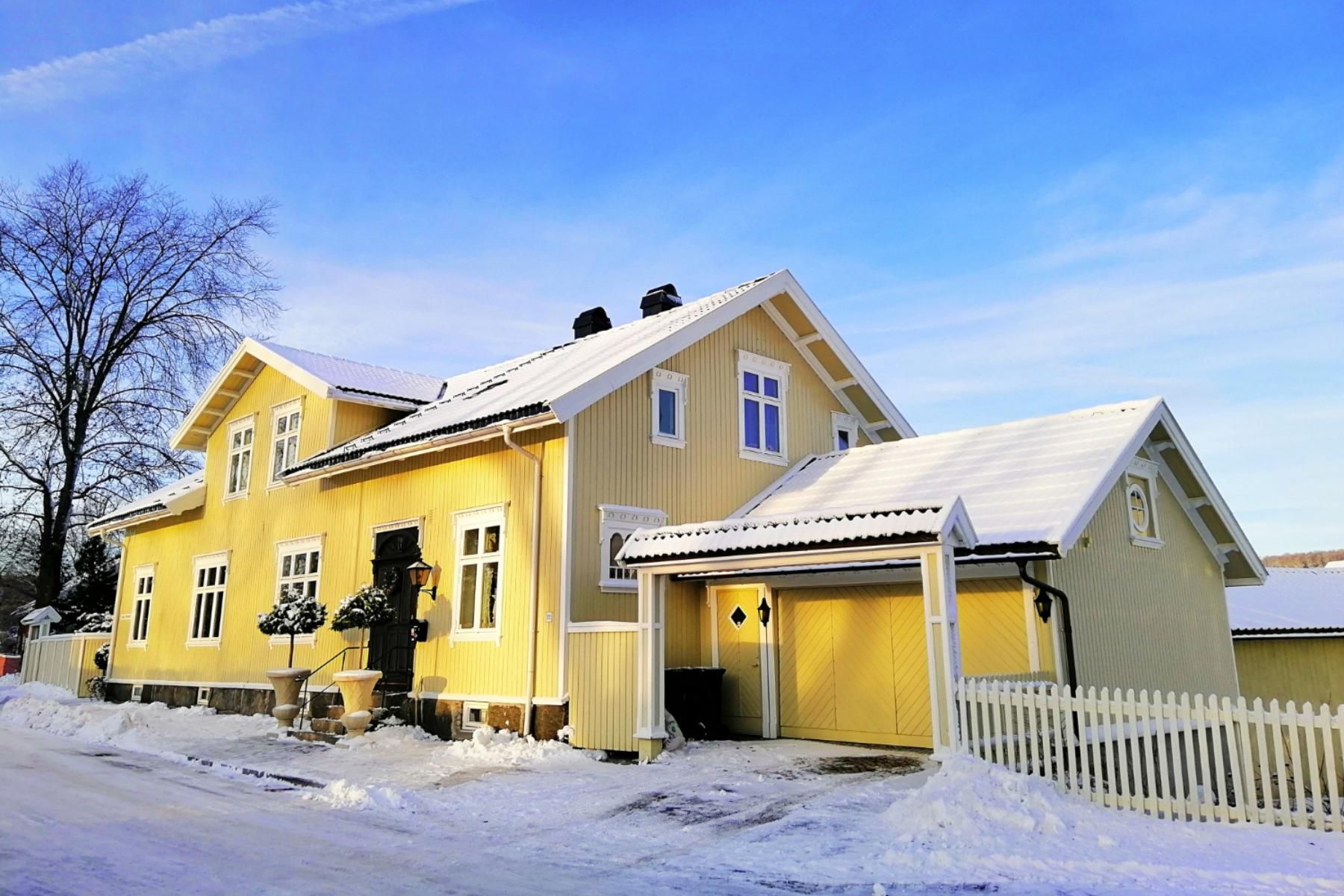
Undertones add another layer of complexity that most homeowners don't see. Every neutral color - white, beige, or gray - has subtle undertones that might clash with your home's existing features. These undertones become visible only when the color meets your furniture, flooring, or trim. A gray with blue undertones might look great against white trim but clash with warm wood cabinets.


Undertones trick even professional decorators. Pink and green undertones can show up unexpectedly on walls. That's why our Saskatoon interior paint team includes a complete color consultation with every project. We've learned to spot these subtle color traits before they turn into costly mistakes.


Our free color consultations help homeowners find the perfect palette for their spaces. The team knows Saskatchewan's unique lighting conditions and their effects on color perception, which helps you avoid the letdown of mismatched wall paint colors.


What a professional color consultation actually includes


Our Saskatoon painting team's professional color consultation goes beyond the quick tips you'd get at a paint store. You'll experience a complete service that takes a closer look at your specific needs and space requirements.


Understanding your space, lighting, and fixed elements


A full picture of your home starts our color consultation process. Our professional consultants review your space in detail and note how natural and artificial light plays with your walls at different times of day. Light can change how colors look dramatically - a perfect shade at noon might look completely different in the evening. We start by looking at your fixed elements - permanent features like stone fireplaces, flooring, countertops, and architectural details that will stay put. These existing elements have undertones we need to think about when picking wall paint colors to create a unified look.


Discussing your style, mood, and goals


We spend time learning about your priorities and objectives, beyond just looking at your space's physical features. Our consultants have detailed conversations about your vision. They ask specific questions about how you use each room and the atmosphere you want to create. Should your bedroom feel peaceful and relaxing? Does your kitchen need to energize and inspire? These talks help us understand more than just your color preferences - we learn what emotional responses you want from your space. This tailored approach will give you final color selections that match both your practical needs and style preferences.


Receiving a custom palette with product and finish suggestions


Our Saskatoon painters create a custom color palette for your home after gathering all this information. You won't get generic advice - instead, you'll receive personalized selections that factor in your unique space, lighting conditions, existing elements, and personal style. Along with color recommendations, we suggest specific paint products and finishes (flat, eggshell, satin, etc.) for each area of your home. Your finish choices matter - they affect both looks and performance. To cite an instance, higher gloss finishes add dimension while matte finishes help hide imperfections. You'll know exactly which products will help achieve your desired results.


The best part? This whole ordeal costs nothing when you choose our interior painting servicesContact our team of experts to determine the right paint color for your walls and see how our free consultation takes the guesswork out of color selection. Our Saskatoon team knows how to suggest modern, trendy colors that work perfectly with Saskatchewan's unique lighting conditions and complement your home's specific features.


How our free color consultation saves you money


Paint color choices can hit homeowners' wallets harder than they expect. Professional color consultation does more than make your home look good—it protects your finances too. Our team of Saskatoon interior painting experts has helped clients save thousands through our free color consultations.


Avoiding repainting costs and wasted materials


Smart color selection saves you money by getting it right the first time. Research shows wrong color choices often mean costly do-overs and unused materials. Our Saskatoon painters help you pick wall colors you'll enjoy for years. You won't need to buy paint, primer, and supplies twice. The costs add up fast. A repaint means more than just extra materials—you'll need time off work and deal with home disruption longer.


Preventing mismatched colors and poor room flow


Expert color advice keeps your home visually connected instead of looking disconnected. Rooms with clashing colors can make your house feel random rather than well-designed. Our Saskatoon team picks colors that flow naturally between spaces. Your paint choices will highlight architectural features instead of working against them. This approach stops you from repainting multiple rooms after realizing they don't match—a mistake that could triple your costs.


Reducing time spent second-guessing decisions


Money matters, and paint swatch indecision wastes both time and cash. Homeowners often spend months questioning their color choices, buying samples, and testing options. They worry about making expensive mistakes during this process. Our interior paint consultations take away this stress with expert advice based on color theory and hands-on experience. You'll get clear, confident suggestions instead of getting stuck in the paint aisle. Your project moves ahead quickly, saving time and reducing stress.


Our free consultation brings even more value since professional color consultants charge between CAD 69.67 to CAD 348.34 per hour. We include this service at no cost with our interior painting projects. Your Saskatoon home gets expert attention without the extra fees.


The step-by-step process of working with our Saskatoon team


Working with our Saskatoon painting team makes choosing paint colors simple. We've made finding your perfect palette efficient and straightforward. This works whether you want to repaint one room or give your entire home a fresh look.


First questionnaire and photo submission


The color consultation starts with an easy-to-follow questionnaire about your priorities, likes, and dislikes. This first step helps our Saskatoon painters learn about your style goals before we meet. You'll need to send us natural light photos of your spaces too. These images help us see and identify the undertones in your home. Unlike doing it yourself, our professional assessment shows how lighting changes color perception throughout the day. Projects under CAD 348.34 come with a free half-hour consultation. Projects above this amount get up to one full hour at no cost.


Virtual or in-person consultation with our painters


You can choose between virtual and in-person consultations based on what works best for you. Our Saskatoon color expert will look at your space's lighting, existing elements like flooring and trim, and talk about your vision for each room. Contact our team of experts to determine the right paint color for your walls. We bring large color swatches and real paint samples, not just tiny chips, so you can see how different shades look in your space. Of course, we know Saskatchewan's unique lighting conditions and how they affect interior paint colors.


Final report with clear instructions and next steps


After your consultation, you'll get a detailed Custom Color Consultation Report that has recommended color schemes with specific paint names, sheens, and placement instructions. This document explains our choices and shows color schemes as visual moodboards to help you see the finished result. We also tell you how to test paint colors properly before final application. The consultation doesn't stop there - we're here to review your paint color tests and make adjustments if needed. This ensures you feel confident and excited about your selections.


Why our expert guidance beats DIY every time


Professional painters bring specialized expertise that sets them apart from DIY color selection. Most homeowners lack the technical knowledge needed for perfect color choices. Our Saskatoon painters offer this expertise as a free service that takes your interior paint project from good to extraordinary.


Understanding undertones and light reflectance


Paint colors are more complex than they appear. Each shade combines two elements: the mass tone (what you see right away) and undertones (subtle hidden hues). These undertones change in strength and can significantly affect a room's atmosphere. Our expert consultants detect hidden blue, green, pink, or yellow undertones that might clash with your current decor. We also know about Light Reflectance Value (LRV) - a scale from 0-100 that shows how much light bounces off a color. This knowledge helps us suggest colors with the right depth for your lighting setup, so rooms don't look too dark or washed out.


Coordinating with furniture, flooring, and trim


Paint works as part of a bigger picture. You might love a certain shade, but it needs to blend well with your permanent fixtures. Our color consultation looks at how wall paint colors work with your existing wood tones, stone features, and flooring. We look at whether your fixed elements are warm or cool and suggest paint colors that boost these features instead of clashing with them. This complete approach takes your entire space into account, not just the walls.


Creating a cohesive look across your home


Our team's ability to create whole-house color schemes ensures rooms flow together naturally. Unlike DIY approaches that often treat each room separately, our Saskatoon team creates smooth transitions throughout your home. We use proven design principles like the 60-30-10 rule (60% dominant color, 30% secondary color, 10% accent color) to keep spaces balanced. This unified approach prevents the disjointed look that often comes from room-by-room DIY painting decisions.  Contact us today to find your correct colour combination!


interior wall repaint
applying two coats of paint on wall
By Revive Painting February 8, 2026
Let us share some paint coating basics that will save you time, money, and frustration before you pick up that paintbrush. Our team at Revive Painting & Wallcovering has watched many DIY projects go wrong because homeowners didn't know how many coats they needed. Here's everything you should know about this common confusion. When one coat might be enough People often ask us if they can get away with just one coat. The answer is yes – but only in specific situations. One coat might be enough if you're painting over a surface that has the same color and sheen, especially with existing paint in excellent condition. This works best in spare bedrooms or hallways where you don't need much durability. High-quality paints with premium formulations can sometimes give you good coverage in a single coat, especially with products that have higher solids content. You might also get by with one application for small touch-ups and quick cosmetic refreshes, but only with the exact same batch and color. Notwithstanding that manufacturers claim "one-coat coverage," these claims rarely work in real-life applications. You might save some money upfront with one coat, but it usually disappoints in its final appearance and costs more because you'll need to repaint sooner. Why two coats is the standard The science behind two-coat standard makes perfect sense to professionals like me. Your first coat builds the foundation – it seals surface pores, evens out texture, and starts the color transition. The second coat gives you accurate color and uniform sheen while covering roller marks and subtle streaks that show up under angled light. Two paint coats create a protective film that handles cleaning, scrubbing, and humidity exposure well. This becomes vital in your kitchen's and bathroom's high-use areas. Paint manufacturers design their products to reach a specific dry film thickness between 3 and 4 mils for homes, and a single coat usually gives you just half that thickness. Two properly applied thinner coats will always look better than one heavy application. Heavy paint application to get one-coat coverage often causes sagging, takes longer to dry, and cures poorly. Even premium "one-coat" products like Behr Marquee or Sherwin-Williams Emerald need two coats to honor their warranties. Your second coat builds up the film strength and improves durability and washability by a lot. This fuller film protects against moisture, ultraviolet damage, and scratches, giving you a longer-lasting paint job and better value over time. How color changes affect coverage Color changes affect the number of coats you'll need. Light colors over dark surfaces typically need more coats for complete coverage – sometimes three or more. The difference between your current color and desired shade plays a big role. Bright reds, oranges, and yellows create unique challenges because they use translucent organic pigments with poor opacity naturally. Even the best paints might need three or more coats to get these colors right. Benjamin Moore suggests using tinted primers for these colors to reduce the finish coats needed. Whites and light colors need special attention too. These colors reflect light and show every flaw, making two uniform coats essential for consistency and a smoother finish, especially under bright lights. A tinted primer can help reduce topcoats needed for dramatic color changes – gray-tinted primer works great when going from light to dark colors. My experience with clients in Saskatoon shows that knowing these basics saves both time and money while giving results that last. The number of coats you choose affects more than just looks—it determines protection, lifespan, and overall maintenance costs. Prepare the Surface for Better Coverage The perfect paint job starts well before you pick up your first brush. Our team at Revive Painting & Wallcovering in Saskatoon has learned that proper surface preparation determines the number of paint coats you'll need. Quality paint can't fix poorly prepared walls. Check wall condition and texture Getting a full picture of your walls is vital. Look at the whole surface to spot cracks, peeling paint, or uneven textures that could ruin your final result. Fresh paint won't hide these flaws—they'll stand out even more once you add color. You'll need to scrape away loose material from cracks or peeling spots, add spackle, then sand until everything's smooth. This detailed prep work might feel slow, but it cuts down the number of paint coats you'll need to achieve a flawless finish. Clean walls let paint stick properly. People often skip this step and end up needing extra coats because the paint won't bond well. Start by dusting with a clean towel or hoovering up loose debris with a brush attachment. Next, use a gentle cleaning solution—mix some baking soda and vinegar or mild dishwashing liquid for most surfaces. Kitchen walls or greasy areas might just need a stronger detergent. Mildew needs immediate attention—don't try to paint over it. The mildew will grow right through new paint layers and create bigger headaches down the road. Mix three to four parts water with one part bleach, put on protective gear, and tackle that mildew before painting. How many coats of primer on new drywall New drywall creates special challenges that affect your paint coat count. Drywall soaks up paint like a sponge, which leads to patchy coverage and wasted paint. Professional painters recommend at least two coats of latex primer on new drywall. This method creates an even base that seals the surface and stops the topcoat from soaking in unevenly. Primer does more than help paint stick—it builds a consistent foundation so your paint color looks true while using fewer topcoats. Drywall mud joints absolutely need primer to prevent "flashing"—those annoying shiny spots in your final paint job. Primer costs nowhere near as much as quality paint per gallon, making it an economical step that saves money over time. When to use primer and when to skip it Not every paint job needs primer, despite what DIY guides might say. Walls in great shape with a similar or lighter color might work fine with high-quality self-priming paint. All the same, primer can boost durability and give you an even sheen. Some situations just need primer: Bare surfaces like new drywall, wood, or metal Big color changes, especially going from dark to light Walls with water damage, smoke, or grease stains Patched or fixed areas Glossy or oil-painted surfaces Primer becomes your best friend during dramatic color changes. The sort of thing I love about tinted primer is how it cuts down topcoat needs when switching between dark and light colors. Without it, old colors can play tricks—like blue walls under yellow paint creating an unexpected green tinge. Note that primer does more than help paint stick—it evens things out, blocks stains, and lets your paint color shine through properly. Well-primed surfaces usually need fewer coats of paint, which saves time and money on your project. Choose the Right Paint and Tools My 15 years as a professional painter at Revive Painting & Wallcovering taught me something valuable - your choice of paint and tools makes a huge difference in the number of coats needed. The right materials can turn a week-long project with multiple store runs into a simple weekend job. How much does a gallon of paint cover You need to know about paint coverage to plan your project properly. Most major manufacturers say one gallon covers 350-400 square feet in a single coat. These numbers change quite a bit based on several things. Premium paints give you better coverage than budget options. Cheaper paints might look like a good deal at first, but you'll need extra coats that wipe out any savings. The surface texture really changes how much paint you'll use. Rough surfaces like stucco need almost double the paint compared to smooth, primed drywall. We've seen this firsthand in our Saskatoon projects - fresh primed surfaces get close to that 400 square foot maximum, while unprimed walls only cover about 300-325 square feet per gallon. Artist-quality paints teach home painters a vital lesson - quality makes all the difference. Better products have more pigment and superior resins, so you need fewer coats. Student-grade paints might cost half as much but need three times more product to get the same results. That's why at Revive Painting & Wallcovering, we only use premium paints. They save our clients money by cutting down on labor and materials. Using a paint calculator to estimate quantity Paint calculators are a great way to get accurate estimates for both pros and DIY fans. You'll find free online calculators from Sherwin-Williams, Benjamin Moore, and Behr that give you spot-on estimates. These tools just need some simple measurements - each wall's length and width, plus how tall your ceilings are. The math is pretty simple if you want to do it yourself: multiply each wall's length by its height, then add everything together for your total square footage. Take a typical 12' x 14' room with 8' ceilings as an example: 2 x (12 x 8) + 2 x (14 x 8) = 416 square feet. After you get the total square footage, divide it by how much one gallon covers (usually 350-400 square feet) to figure out your paint needs. Our example room would need 416 ÷ 375 = 1.1 gallons per coat. Most quality paint jobs need two coats to look good and last long, so you'd need about 2.2 gallons total. I always tell people to add 10% extra for spills, touch-ups, and uneven spots. This buffer has saved many projects from annoying mid-job store runs. Looking at our 416 square foot room, you'd need roughly 2.4 gallons - so grab three gallons to be safe. Brush vs. roller: which gives better coverage The choice between brush and roller isn't just about coverage. Rollers handle big areas faster, but brushes work better in certain spots. A good brush gives you more control, uses less paint, and works better on textured surfaces than rollers do. A fully-loaded roller should cover about 9 square feet of wall. Rollers spread paint more evenly with fewer visible marks than brushes, which makes them perfect for large, flat areas. Brushes shine when you're working around trim, corners, and ceilings where you need precision more than speed. Your roller choice really matters for coverage quality. Smooth walls and glossy finishes work best with a 1/4-inch nap, while textured surfaces need 1/2 or 3/4-inch naps to fill all the gaps. High-quality microfiber roller covers hold and release more paint evenly, so you get smoother results and better coverage with fewer coats. Paint manufacturers might promise one-coat coverage, but my work at Revive Painting & Wallcovering shows that two thin coats always look better than one thick one. This stays true whether you're using a brush or roller. Going for one-coat coverage usually leads to thick, uneven paint that drips, sags, and takes forever to dry. Apply Paint the Right Way Your paint selection and surface preparation are done. Now the way you apply the paint will determine if you get professional results with fewer coats. We at Revive Painting & Wallcovering have mastered techniques that deliver smooth, streak-free finishes on walls throughout Saskatoon. How to paint a wall without streaks The quickest way to get streak-free walls depends on proper technique and paint application. Load your roller evenly—it should be saturated but not dripping. You need to apply paint generously. A time to reload comes when you're pressing hard on the roller to get paint on the wall. The "W" or "M" method works best for smooth results. Roll paint in this pattern first, then fill gaps with straight strokes. This approach prevents uneven distribution and creates consistent coverage. While cutting in edges, press your loaded brush firmly to apply a thicker layer about 1 to 1.5 inches from the border. Then lightly feather the paint to the edge. Don't overwork the paint since it starts drying right after application. Work in manageable 3-foot by 3-foot sections to spot touch-up areas before they dry. You can prevent roller lines by gently rolling back over visible trails in the opposite direction. How long between coats of paint Time between coats is vital for a durable finish. Latex paints need 2-4 hours before you apply a second coat. Oil-based paints take much longer—about 24 hours between applications. Rushing creates peeling paint, uneven color, or bubbling from trapped moisture. Weather conditions affect these timeframes significantly. High humidity makes drying periods longer. Each coat must dry completely until the color looks uniform across the surface. Tips for maintaining a wet edge A "wet edge" technique helps achieve seamless results. This means you need to apply new paint next to areas that haven't dried yet. Missing this step creates lap marks—visible lines where wet paint meets dried sections. You can maintain a wet edge by: Breaking walls into manageable sections Working quickly and methodically Planning breaks at natural interruptions like windows or corners Paint from "wet to dry" instead of the other way around for the best results. This method creates a smooth, uniform look without noticeable overlaps between sections. High-quality paints with better "wet edge" properties give you more time to work before drying starts, especially on large areas. Special Cases That May Need Extra Coats Some painting jobs just need extra attention and more coats whatever your prep work. My experience with Revive Painting & Wallcovering shows that standard two-coat applications don't always cut it. Painting over dark or bold colors Color changes from dark to light shades bring unique challenges. We painted over navy, charcoal, and burgundy to lighter neutrals and usually needed three or more coats for full coverage. Dark pigments tend to bleed through even quality paint, which leads to patchy and uneven results. You can cut down on topcoats by using tinted primers made for color transitions. A gray-tinted primer works better than pure white for bold colors. Textured or porous surfaces Texture makes paint consumption go up faster. You'll need extra coats on rough surfaces like unsealed concrete, textured drywall, and bare wood because they soak up paint quickly. Start by cleaning textured walls really well - vacuum first, then use TSP cleaner. Longer nap rollers (3/4" to 1½") work best since their fibers reach deep into textures and give better coverage. Seal porous materials with 2-3 coats of sealant or use a mist coat - paint mixed with 5-10% water - before painting. Ceilings, trims, and high-traffic areas Ceilings can be tricky, especially with stains or bare surfaces. You'll want stain-blocking primers for water marks or smoke damage. High-traffic spots need extra coats to last longer - two coats will give you a strong barrier against moisture, wear, and scrapes. These extra layers make cleaning easier and save money on maintenance. Need help? Let Revive Painting and Wallcovering handle your interior painting in Saskatoon. We know how to tackle challenging projects and deliver professional results without endless coats or poor coverage. Key Takeaways Understanding the right number of paint coats saves time, money, and ensures professional-quality results that last longer:  • Two coats is the professional standard - The first coat seals and evens texture, while the second delivers true color and durability • Surface preparation determines coat requirements - Clean, primed surfaces need fewer coats than unprepared walls with stains or damage • Color changes dramatically impact coverage needs - Dark to light transitions often require 3+ coats, while tinted primers reduce topcoat requirements • Quality paint and proper technique reduce coat count - Premium paints with higher solids content provide better coverage than budget alternatives • Special surfaces demand extra attention - Textured walls, ceilings with stains, and high-traffic areas typically need additional coats for optimal protection Investing in proper preparation, quality materials, and correct application techniques upfront prevents the frustration and expense of multiple repainting projects down the road.
wainscoting painting
By Revive Painting January 28, 2026
Wainscoting has stood the test of time since the 1300s, and with good reason too. It's not just another fleeting interior design trend. This classic wall treatment brings both practical benefits and timeless appeal that can improve your Saskatoon home by a lot. Wainscoting does more than just decorate - it acts as a protective barrier against daily wear and tear. Your walls stay protected from scuffs, dents, and scratches that happen over time in busy areas like hallways and dining rooms. It also makes cleaning a breeze - just wipe with a damp cloth instead of constantly touching up painted walls. You might be surprised by wainscoting's acoustic benefits. These wooden panels help absorb sound and reduce echoes and noise levels. Rooms with hard flooring surfaces benefit especially since sound tends to bounce, which creates a more relaxed living environment. The right chair rail height can make your space look completely different. Your ceilings can appear taller, giving rooms an airier feel. This visual trick works wonders in smaller spaces or rooms with lower ceilings. Paint options for wainscoting are endless. White wainscoting against bold-colored walls creates classic contrast. Using the same color in different sheens adds subtle sophistication. Bathrooms need moisture-resistant options with semi-gloss finishes that are easy to clean and last longer. Quality wainscoting can boost your home's resale value. Buyers love architectural details that make spaces feel custom-designed. Houses with well-done wainscoting often look more elegant, making them more marketable. Different styles suit any interior design theme. Beadboard adds cottage charm, raised panels bring formal elegance, and board and batten creates modern appeal. Each option turns ordinary walls into standout features without needing a complete renovation. Understanding the Basics Before You Paint You need to understand wainscoting basics before starting your paint work to achieve professional results in your Saskatoon home. What is wainscoting and why it matters Wainscoting refers to decorative paneling installed on the lower portion of interior walls. It covers one-third of the wall height and follows the classic "rule of thirds". This 18th-century innovation protected walls from damage and provided extra insulation in drafty homes. It also improved the beauty of vintage interiors. Modern wainscoting serves mostly as decoration, yet it gives you both protection and visual appeal that lifts any space. Wainscoting does more than look good. The architectural detail makes rooms feel complete and purposeful. Saskatoon's climate often forces people to push furniture against walls during winter gatherings. This wall treatment acts as a practical shield against scuffs and dents. Different types of wainscoting you might have Here are six main wainscoting styles that create unique looks: Raised Panel : Traditional with beveled edges, ideal for formal dining rooms (30-40 inches high) Flat Panel : Clean, modern appearance with smooth panels that create depth without beveling Beadboard : Features narrow vertical grooves, perfect for cottage-style bathrooms and informal spaces Board and Batten : Vertical boards (usually 4-6 inches wide) spaced about 10 inches apart, excellent for contemporary homes Overlay : Combines raised and flat panel styles for a deeper, more detailed appearance Vinyl Panel : Waterproof PVC option ideal for bathrooms and high-humidity areas Your room's specific needs determine the material choice. Options range from traditional solid woods like pine, oak, and cherry to budget-friendly MDF or moisture-resistant PVC. How wainscoting affects home value A well-installed wainscoting can boost your home's value above its installation cost. Saskatoon buyers love the high-quality craftsmanship look that wainscoting provides. This architectural feature stands out as one of the most cost-effective ways to improve interior beauty and home value. White painted wainscoting in main living areas gives you the best return on investment. Future homeowners can easily change wall colors above it, creating timeless appeal. Rich stained wainscoting in cherry or oak tones can make your property stand out as more luxurious in competitive markets. Choosing the Right Paint and Finish Picking the right paint and finish is crucial to turn your wainscoting from basic to stunning. As Saskatoon's experienced painting contractors, we've seen how smart choices can boost your home's appeal and value. Should you paint wainscoting the same color as the wall? Using similar colors for walls and wainscoting creates a modern look that makes your space feel bigger. This works best with different sheens - a satin finish on walls with semi-gloss on wainscoting adds subtle dimension. You might also want to think about using lighter and darker shades of the same color family. This adds depth while keeping everything tied together nicely. When to go with white vs. bold colors White wainscoting is a safe bet that fits most interiors. All the same, you can make a bold statement with colors like raspberry pink or robin's egg blue. These work great with complementary wallpaper above. If you're selling your Saskatoon home, classic white wainscoting offers timeless appeal and lets buyers imagine their own wall color choices easily. Stain or paint: what works best for your space We used paint to hide wood grain and defects while creating a modern look. Staining shows off the natural wood beauty but needs more careful surface prep. Stained wainscoting looks great in rooms with existing wooden elements, while painted options give you cleaner, brighter results. Ideas for painting wainscoting in bathrooms and kitchens Bathrooms and kitchens just need extra attention because of moisture exposure . Semi-gloss or satin finishes are your best bet here since they're durable and easy to clean. Warm neutral tones like Natural Linen or Huntington Beige look fantastic with dark cabinetry. Note that you should prime both sides of panels in bathrooms so they don't warp from humidity changes. Step-by-Step: How to Paint Wainscoting Like a Pro Professional-looking wainscoting depends on the actual hands-on process. My experience as a Saskatoon painting contractor has helped me perfect these techniques through hundreds of installations. Prepping the surface: cleaning and sanding You should clean the surface with warm soapy water and let it dry. Sand previously painted surfaces that have a semi-gloss or gloss finish, unless you're dealing with lead paint . A 180-220 grit sandpaper works best for peeling paint or bare wood. The surface needs vacuuming and a wipe-down with a microfiber cloth. Priming for a smooth finish MDF surfaces need acrylic primer - Fresh Start from Benjamin Moore gives excellent results. It covers well, dries fast and sands smoothly. STIX Waterborne Bonding Primer works best for older homes with previously painted wainscoting because it sticks better. Best tools and brushes to use Quality angled brushes and microfiber rollers designed for trim make a big difference. These tools help create that smooth, professional finish you want. Painting techniques for even coverage Paint in two-foot sections instead of doing all horizontal pieces first. Short strokes work best for horizontal rails. Follow up with long vertical strokes on grooves right away. This approach prevents drips and creates clean directional finishes. Painting wainscoting before and after: what to expect The whole project takes 2-3 days - one day to prep and prime, another to paint. You'll need two coats for full coverage. Your home's interior will look dramatically better with properly painted wainscoting. Where It Works Best and How to Style It Wainscoting changes ordinary rooms into showcases of architectural interest. My experience as a Saskatoon painting contractor shows how strategic placement and thoughtful styling can maximize its effect. Painting wainscoting in living rooms and hallways Living rooms gain character from wainscoting that complements existing architectural elements . The wainscoting's finish should match fireplace mantels to create cohesive designs. Hallways look elegant when their wainscoting and walls share similar colors, while door frames stand out in contrasting shades. Rich chocolate browns combined with vintage blues add warmth to transitional spaces. Using wainscoting to define open spaces Wainscoting does more than just look good - it segments larger areas without physical barriers. A single wall of wainscoting creates a dynamic focal point that works well in Saskatoon's open-concept homes. The technique can outline dining spaces and define home office zones within multipurpose rooms. How height and proportion affect the look Traditional wainscoting covers about one-third of wall height. Rooms become more dramatic and less conventional when wainscoting runs two-thirds or three-quarters up the walls. Taller wainscoting (36-48 inches) maintains balanced proportions in rooms with lofty ceilings. Pairing wainscoting with wallpaper or color blocks Classic white wainscoting paired with dark patterned wallpaper creates high-contrast sophistication. Color blocking offers another option - use contrasting yet complementary shades between upper walls and wainscoting. Saskatoon's historic homes look authentic with wainscoting and trompe l'oeil architectural wallpaper that boosts their period character. A Small Change That Makes a Big Impact Wainscoting stands out as the smartest dollar-for-dollar home improvement investment you'll make. Professional painted wainscoting adds more property value than its installation costs. This renovation ranks among the most cost-effective ways to enhance interior appeal. Homes with quality wainscoting sell faster and fetch better prices, according to real estate experts. The architectural detail raises visual interest by adding depth, texture, and character that basic walls can't match. A simple installation transforms spaces into custom-built, designer-quality rooms. Saskatoon homeowners can maximize their returns with these value-adding combinations: White wainscoting against deep navy or charcoal walls creates lasting appeal Monochromatic designs using different sheens (matte walls with semi-gloss wainscoting) add subtle sophistication Bathroom beadboard painted with moisture-resistant semi-gloss finishes Wainscoting's versatility makes it perfect for formal dining rooms, cozy bedrooms, or practical kitchens. This modest investment delivers significant results in both beauty and value throughout the house. The right color choices paired with wainscoting make it one of the few home improvements that pays for itself while offering immediate visual impact. Key Takeaways Transform your home's value and appeal with these essential wainscoting painting insights that deliver maximum impact for minimal investment. • Proper preparation is crucial : Clean thoroughly, sand glossy surfaces, and use quality primer like Benjamin Moore Fresh Start for professional results that last. • Strategic color choices maximize impact : White wainscoting offers timeless appeal and broad buyer appeal, while bold colors create dramatic focal points in specific rooms. • Height and proportion matter : Follow the rule of thirds (one-third wall height) for traditional looks, or go taller (36-48 inches) in rooms with high ceilings. • Different finishes serve different purposes : Use semi-gloss in bathrooms and kitchens for moisture resistance, while satin works well in living areas for easy cleaning. • Wainscoting delivers exceptional ROI : This architectural feature often increases property value beyond installation costs and helps homes sell faster in competitive markets.  Beyond esthetics, wainscoting provides practical benefits including wall protection from scuffs and scratches, improved acoustics, and easier maintenance compared to painted walls. The key to success lies in matching the wainscoting style to your home's architecture and choosing finishes appropriate for each room's specific needs.