Types of Wallpaper: Expert Guide to Choosing Your Perfect Pattern

Revive Painting • November 6, 2025

Learning about different wallpaper types can change your home in ways paint simply cannot. Our team at Revive Wallpaper and Painting in Saskatoon has seen wallpaper last a decade or more, which saves our clients both time and money. This impressive durability makes wallpaper a smart long-term investment for your home, not just a design choice. Our expert knowledge helps customers who feel overwhelmed by the big selection available.


Wallpaper materials offer something for every taste and practical need. Vinyl wallpaper remains one of the most versatile wallcoverings available today and provides an ideal solution for busy households. It also works perfectly in high-moisture areas like kitchens and bathrooms thanks to its water- and vapor-resistant properties. Natural texture lovers appreciate grasscloth wallpaper made from plant fibers such as sisal, seagrass, arrowroot, bamboo, and jute. This material brings organic warmth to any space. Luxury seekers often choose flock wallpaper with its velvety texture and artisanal feel. This opulent option needs special care and suits lower-traffic areas best. Foil wallpaper's metallic finish turns any wall into a stunning centerpiece. Our expertise helps clients direct their way through these options to find their perfect match.


Understanding Wallpaper Materials


We've installed pretty much every type of wallpaper you can find in today's market. The material you choose will substantially affect not just how it looks, but also how long it lasts, how much care it needs, and how tricky it is to put up. Let me tell you about the most popular types we work with at Revive Wallpaper and Painting.


Vinyl: Durable and easy to clean


Vinyl wallpaper rules the market, and with good reason too. It's the toughest option out there - you can scrub it clean with mild detergent and water. Our Saskatoon clients love that we can put vinyl in high-traffic areas, especially kitchens and bathrooms, where its water-resistant properties really shine. Fabric-backed vinyl works great in hallways and stairways where walls take a beating from kids, pets, and furniture. Vinyl wallcoverings last up to five times longer than paint, which saves about 30% over time. Solid vinyl gives peace of mind to families with children or pets because you can clean it without worrying about damage.


Grasscloth: Natural texture with a premium feel


Paint just can't match the sophisticated, organic look that grasscloth's natural fibers create. But we always tell our clients they need to think carefully about grasscloth. You can only dust it gently because it soaks up liquids. We're extra careful when installing it since you'll always see the seams—that's just part of what makes it special. Each roll has its own unique texture and color that adds to that handmade feel. We usually suggest grasscloth for bedrooms, dining rooms, or formal living spaces where you can enjoy its natural beauty away from moisture or heavy wear.


Flock: Soft, velvety and luxurious


The velvety texture of flock wallpaper adds luxury to any room. People first created it to copy expensive cut-velvet hangings, but modern flock uses synthetic fibers like polyester or rayon for that special raised pattern. We handle it very carefully during installation because of its delicate surface. These wallpapers work best in quieter spots like formal dining rooms or master bedrooms. The three-dimensional patterns, often with pearly or metallic backgrounds, create amazing depth.


Foil and Metallic: Reflective and dramatic


Foil wallpaper makes walls come alive with its bright, reflective surface. Real metal foil sits on top of a carrier layer, creating a shimmer that changes with the light throughout the day. We need to be super precise when putting up foil wallpapers because any tiny wall bump shows up more on shiny surfaces. The results make the extra effort worthwhile—especially in dining rooms, powder rooms, or accent walls where light creates beautiful effects.


Peel and Stick: Flexible and renter-friendly


Renters and people who like changing their decor often love peel and stick wallpaper. You don't need separate paste because it's self-adhesive. Even though it's marketed as DIY-friendly, many clients ask us to install it to make sure the surface is ready and there are no bubbles. Peel and stick wallpaper does have its limits—it needs perfectly smooth walls and might not stick well to textured surfaces.


Exploring Wallpaper Design Styles


The right wallpaper design can raise a room from ordinary to extraordinary. Our team at Revive Wallpaper and Painting has helped many Saskatoon homeowners pick patterns that show their personality and match their home's architecture.


Floral and botanical patterns


Floral wallpaper designs have been classics in interior design for decades. These patterns range from gentle blossoms to striking botanicals and add a touch of sophistication to any space. Our clients love floral patterns because they blend with many design styles. The year 2025 has brought more interest in huge, mural-style florals and playful micro-patterns that give rooms subtle character. Homeowners who want to bring nature indoors often choose botanical wallpapers with rich foliage and tropical leaves. These create fresh spaces that look alive all year.


Geometric and modern designs


Geometric patterns work best for clients who prefer clean lines and simplicity. Modern designs feature triangles, hexagons, and diamonds in subtle neutrals or bright colors. These patterns look great in home offices and living rooms where people want a clean, organized look. Geometric wallpapers create rhythm and order that turn plain walls into eye-catching features.


Damask and vintage-inspired looks


Damask wallpaper brings luxury to any space with its refined patterns that come from Victorian fabrics. These enduring designs add royal beauty to walls and work in both classic and modern settings. Clients who love vintage style often pick retro-inspired patterns that bring back the glamor of past decades. Modern designers have given traditional damasks fresh updates by mixing old-world patterns with new touches.


Brick, wood, and tile imitations


Faux brick, wood, and stone wallpapers rank among our most popular choices. They create realistic effects without the cost or commitment of actual materials. These designs let homeowners get that exposed brick wall they've wanted or the weathered wood accent they love—without needing construction work. Many designs use raised inks to add texture and make the effect more realistic. They're perfect for feature walls in both rental properties and permanent homes.


Murals and large-scale visuals


Technology has changed what wallpaper can do. Unlike regular repeating patterns, murals create whole scenes that work as living space artwork. These large designs look amazing in entryways and dining rooms where people can step back and take in the whole picture. They turn ordinary walls into stunning focal points with abstract art, bold florals, or beautiful nature scenes.


Types of Wallpaper Finishes and Textures


The finish and texture of wallpaper do more than just look good - they change how light plays in your space and how the walls feel when touched. Our team at Revive Wallpaper and Painting has seen these subtle details create dramatic room transformations over years of installations.


Matte vs. shiny finishes


Matte wallpapers don't reflect light, which helps hide wall flaws and creates an elegant, understated look. Many of our Saskatoon clients choose matte finishes because they add depth to interiors by softly diffusing light. Glossy wallpapers, on the other hand, bounce light around the room. This makes small spaces look bigger and brings out vibrant colors. You should know that glossy finishes wipe clean easily, but they also show every little bump and flaw in your walls.


Embossed and textured surfaces


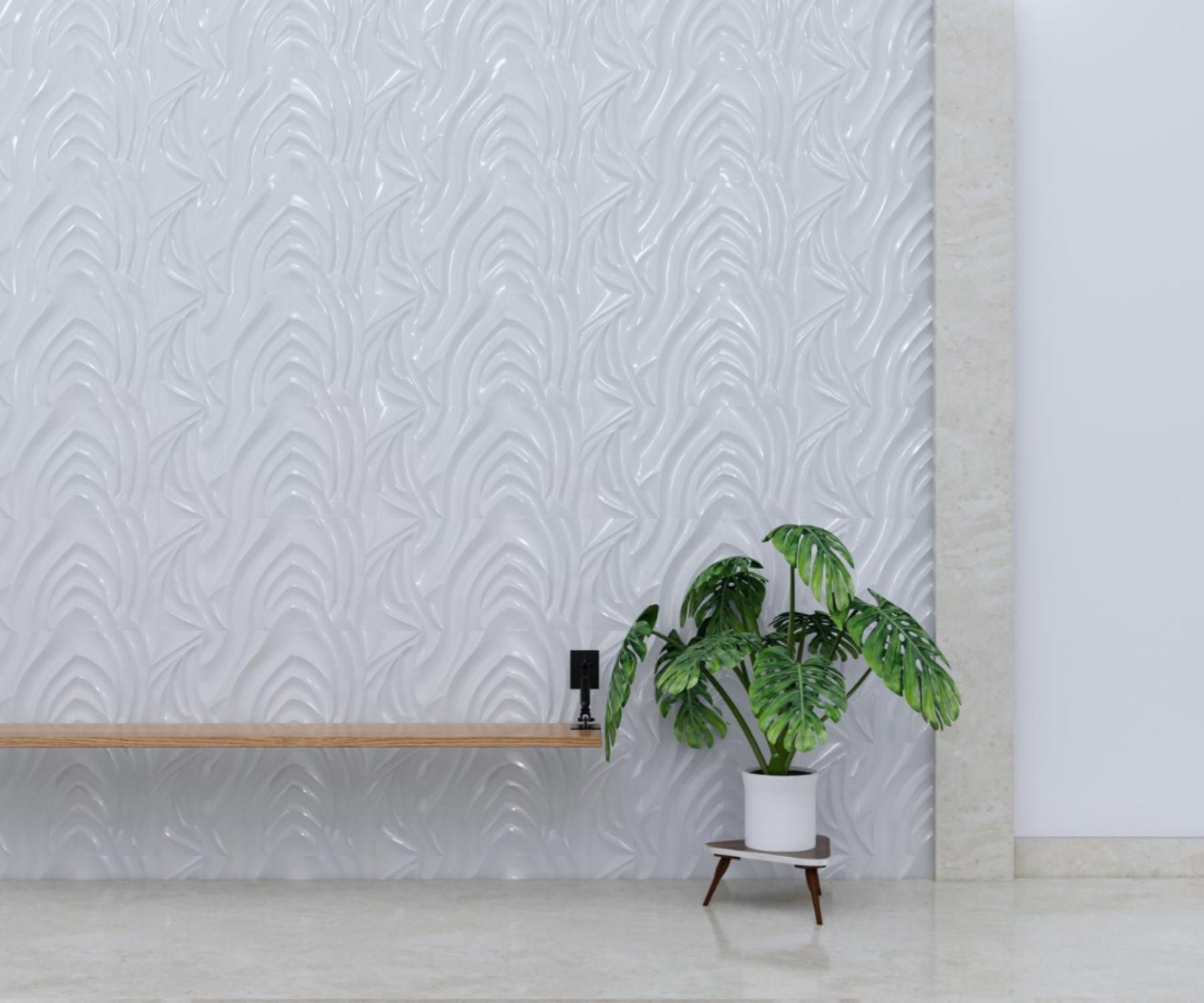
Textured wallpapers bring a unique depth and character that flat surfaces just can't match. You'll find everything from subtle raised patterns to bold 3D effects that become stunning focal points. These textures work great in older homes by hiding minor wall flaws. Our clients are always amazed to see how different their textured walls look as sunlight moves across them throughout the day.


Metallic and pearlescent effects


Metallic wallpapers catch and scatter light in eye-catching ways. Gold metallic accents make bedrooms and dining rooms feel luxurious, especially when paired with rich burgundy, navy, or purple tones. Pearl finishes offer a gentler shimmer, adding elegance without dominating the room.


Paintable wallpaper options


Paintable wallpapers give you amazing flexibility with their raised designs that match any color scheme. These innovative wall coverings come in paper or vinyl with repeating patterns. They hide wall imperfections beautifully, and you can repaint them multiple times as your color choices evolve. Homeowners love this combination of texture and color control.


Installation Methods and Room Suitability


The right installation method plays a vital role in any wallpaper project's success, beyond just picking patterns or materials. Our team at Revive Wallpaper and Painting has seen rooms completely transformed when wallpaper gets installed properly.


Paste-the-wall vs. paste-the-paper


These two main installation methods are no match for each other in how they work and what they suit best. Non-woven wallpapers work best with paste-the-wall method since they stay stable when wet. This newer approach lets you apply adhesive straight to the wall like paint. You won't need big pasting tables anymore. The traditional paste-the-paper technique works best for papers that get bigger when wet. These papers need "booking" time - about 5 minutes of folding the paper onto itself after pasting before you can hang them.


Pre-pasted and peel-and-stick options


Pre-pasted wallpaper comes with adhesive already applied at the factory that water activates. Light misting works better than soaking to avoid mess and too much wetness. Peel-and-stick varieties work just like big stickers. Renters and frequent redecorators love them. Even though they're marketed as DIY-friendly, many clients prefer our professional installation services. This ensures no bubbles and properly prepared surfaces.


Best wallpaper types for kitchens and bathrooms


Vinyl wallcoverings work best in areas with moisture. Their water-resistant qualities make them perfect for kitchens and bathrooms where splashes and humidity happen often. Bathrooms need vinyl-coated options that handle steam while letting the wall breathe. Good airflow matters - even the toughest water-resistant wallpaper needs proper ventilation to avoid moisture problems.


Choosing wallpaper for bedrooms and living rooms


Bedrooms and living spaces give you more wallpaper choices. These drier rooms let you use fancy options like grasscloth or velvet-textured flocked papers. Revive Painting and Wallpaper - Saskatoon's best wallpaper installers can help you pick the perfect texture for your living spaces. Our team guides clients toward peaceful patterns in cool or earthy tones that turn bedrooms into calm sanctuaries.


Accent walls vs. full room coverage


Your budget often decides between an accent wall or full coverage. One feature wall creates big visual impact without spending much compared to doing the whole room. Full coverage creates an immersive feel but requires working around corners, outlets, windows, and door frames while keeping patterns lined up. We usually suggest accent walls for beginners - they forgive mistakes more easily while still looking dramatic.


Need more help?  Let our team help!  We're wallpaper specialists in Saskatoon.  Contact us today.


FAQs


Q1. How do I choose the right wallpaper pattern for my space? Consider your room's size, lighting, and purpose. For smaller spaces, opt for lighter colors and smaller patterns to create an illusion of space. In larger rooms, you can experiment with bold, large-scale designs. Also, think about the mood you want to create - serene patterns for bedrooms, dynamic designs for living areas.

Q2. What type of wallpaper is best for high-moisture areas like kitchens and bathrooms? Vinyl wallpaper is ideal for kitchens and bathrooms due to its water-resistant properties. It can withstand humidity and occasional splashes, making it durable and easy to clean. For bathrooms specifically, vinyl-coated options that resist steam while remaining breathable are recommended.

Q3. Are there wallpaper options suitable for renters or those who like to change decor frequently? Yes, peel-and-stick wallpaper is an excellent option for renters or those who enjoy frequent decor changes. It's easy to apply and remove without damaging walls. Pre-pasted wallpapers are another flexible option, featuring factory-applied adhesive that activates with water for simpler installation.

Q4. What are the benefits of using textured wallpaper? Textured wallpapers add depth and character to a room that flat surfaces can't achieve. They create visual interest, provide a tactile experience, and can effectively hide minor wall imperfections. Textured wallpapers also change appearance as lighting shifts throughout the day, adding dynamic visual effects to your space.

Q5. Should I wallpaper an entire room or just create an accent wall? The choice between an accent wall and full room coverage depends on your budget, desired impact, and room characteristics. An accent wall can create a dramatic focal point with less investment, while full room coverage offers a more immersive, cohesive atmosphere. For beginners, starting with an accent wall is often recommended as it's more forgiving and still delivers impressive results.


wallpaper feature in Saskatoon
applying two coats of paint on wall
By Revive Painting February 8, 2026
Let us share some paint coating basics that will save you time, money, and frustration before you pick up that paintbrush. Our team at Revive Painting & Wallcovering has watched many DIY projects go wrong because homeowners didn't know how many coats they needed. Here's everything you should know about this common confusion. When one coat might be enough People often ask us if they can get away with just one coat. The answer is yes – but only in specific situations. One coat might be enough if you're painting over a surface that has the same color and sheen, especially with existing paint in excellent condition. This works best in spare bedrooms or hallways where you don't need much durability. High-quality paints with premium formulations can sometimes give you good coverage in a single coat, especially with products that have higher solids content. You might also get by with one application for small touch-ups and quick cosmetic refreshes, but only with the exact same batch and color. Notwithstanding that manufacturers claim "one-coat coverage," these claims rarely work in real-life applications. You might save some money upfront with one coat, but it usually disappoints in its final appearance and costs more because you'll need to repaint sooner. Why two coats is the standard The science behind two-coat standard makes perfect sense to professionals like me. Your first coat builds the foundation – it seals surface pores, evens out texture, and starts the color transition. The second coat gives you accurate color and uniform sheen while covering roller marks and subtle streaks that show up under angled light. Two paint coats create a protective film that handles cleaning, scrubbing, and humidity exposure well. This becomes vital in your kitchen's and bathroom's high-use areas. Paint manufacturers design their products to reach a specific dry film thickness between 3 and 4 mils for homes, and a single coat usually gives you just half that thickness. Two properly applied thinner coats will always look better than one heavy application. Heavy paint application to get one-coat coverage often causes sagging, takes longer to dry, and cures poorly. Even premium "one-coat" products like Behr Marquee or Sherwin-Williams Emerald need two coats to honor their warranties. Your second coat builds up the film strength and improves durability and washability by a lot. This fuller film protects against moisture, ultraviolet damage, and scratches, giving you a longer-lasting paint job and better value over time. How color changes affect coverage Color changes affect the number of coats you'll need. Light colors over dark surfaces typically need more coats for complete coverage – sometimes three or more. The difference between your current color and desired shade plays a big role. Bright reds, oranges, and yellows create unique challenges because they use translucent organic pigments with poor opacity naturally. Even the best paints might need three or more coats to get these colors right. Benjamin Moore suggests using tinted primers for these colors to reduce the finish coats needed. Whites and light colors need special attention too. These colors reflect light and show every flaw, making two uniform coats essential for consistency and a smoother finish, especially under bright lights. A tinted primer can help reduce topcoats needed for dramatic color changes – gray-tinted primer works great when going from light to dark colors. My experience with clients in Saskatoon shows that knowing these basics saves both time and money while giving results that last. The number of coats you choose affects more than just looks—it determines protection, lifespan, and overall maintenance costs. Prepare the Surface for Better Coverage The perfect paint job starts well before you pick up your first brush. Our team at Revive Painting & Wallcovering in Saskatoon has learned that proper surface preparation determines the number of paint coats you'll need. Quality paint can't fix poorly prepared walls. Check wall condition and texture Getting a full picture of your walls is vital. Look at the whole surface to spot cracks, peeling paint, or uneven textures that could ruin your final result. Fresh paint won't hide these flaws—they'll stand out even more once you add color. You'll need to scrape away loose material from cracks or peeling spots, add spackle, then sand until everything's smooth. This detailed prep work might feel slow, but it cuts down the number of paint coats you'll need to achieve a flawless finish. Clean walls let paint stick properly. People often skip this step and end up needing extra coats because the paint won't bond well. Start by dusting with a clean towel or hoovering up loose debris with a brush attachment. Next, use a gentle cleaning solution—mix some baking soda and vinegar or mild dishwashing liquid for most surfaces. Kitchen walls or greasy areas might just need a stronger detergent. Mildew needs immediate attention—don't try to paint over it. The mildew will grow right through new paint layers and create bigger headaches down the road. Mix three to four parts water with one part bleach, put on protective gear, and tackle that mildew before painting. How many coats of primer on new drywall New drywall creates special challenges that affect your paint coat count. Drywall soaks up paint like a sponge, which leads to patchy coverage and wasted paint. Professional painters recommend at least two coats of latex primer on new drywall. This method creates an even base that seals the surface and stops the topcoat from soaking in unevenly. Primer does more than help paint stick—it builds a consistent foundation so your paint color looks true while using fewer topcoats. Drywall mud joints absolutely need primer to prevent "flashing"—those annoying shiny spots in your final paint job. Primer costs nowhere near as much as quality paint per gallon, making it an economical step that saves money over time. When to use primer and when to skip it Not every paint job needs primer, despite what DIY guides might say. Walls in great shape with a similar or lighter color might work fine with high-quality self-priming paint. All the same, primer can boost durability and give you an even sheen. Some situations just need primer: Bare surfaces like new drywall, wood, or metal Big color changes, especially going from dark to light Walls with water damage, smoke, or grease stains Patched or fixed areas Glossy or oil-painted surfaces Primer becomes your best friend during dramatic color changes. The sort of thing I love about tinted primer is how it cuts down topcoat needs when switching between dark and light colors. Without it, old colors can play tricks—like blue walls under yellow paint creating an unexpected green tinge. Note that primer does more than help paint stick—it evens things out, blocks stains, and lets your paint color shine through properly. Well-primed surfaces usually need fewer coats of paint, which saves time and money on your project. Choose the Right Paint and Tools My 15 years as a professional painter at Revive Painting & Wallcovering taught me something valuable - your choice of paint and tools makes a huge difference in the number of coats needed. The right materials can turn a week-long project with multiple store runs into a simple weekend job. How much does a gallon of paint cover You need to know about paint coverage to plan your project properly. Most major manufacturers say one gallon covers 350-400 square feet in a single coat. These numbers change quite a bit based on several things. Premium paints give you better coverage than budget options. Cheaper paints might look like a good deal at first, but you'll need extra coats that wipe out any savings. The surface texture really changes how much paint you'll use. Rough surfaces like stucco need almost double the paint compared to smooth, primed drywall. We've seen this firsthand in our Saskatoon projects - fresh primed surfaces get close to that 400 square foot maximum, while unprimed walls only cover about 300-325 square feet per gallon. Artist-quality paints teach home painters a vital lesson - quality makes all the difference. Better products have more pigment and superior resins, so you need fewer coats. Student-grade paints might cost half as much but need three times more product to get the same results. That's why at Revive Painting & Wallcovering, we only use premium paints. They save our clients money by cutting down on labor and materials. Using a paint calculator to estimate quantity Paint calculators are a great way to get accurate estimates for both pros and DIY fans. You'll find free online calculators from Sherwin-Williams, Benjamin Moore, and Behr that give you spot-on estimates. These tools just need some simple measurements - each wall's length and width, plus how tall your ceilings are. The math is pretty simple if you want to do it yourself: multiply each wall's length by its height, then add everything together for your total square footage. Take a typical 12' x 14' room with 8' ceilings as an example: 2 x (12 x 8) + 2 x (14 x 8) = 416 square feet. After you get the total square footage, divide it by how much one gallon covers (usually 350-400 square feet) to figure out your paint needs. Our example room would need 416 ÷ 375 = 1.1 gallons per coat. Most quality paint jobs need two coats to look good and last long, so you'd need about 2.2 gallons total. I always tell people to add 10% extra for spills, touch-ups, and uneven spots. This buffer has saved many projects from annoying mid-job store runs. Looking at our 416 square foot room, you'd need roughly 2.4 gallons - so grab three gallons to be safe. Brush vs. roller: which gives better coverage The choice between brush and roller isn't just about coverage. Rollers handle big areas faster, but brushes work better in certain spots. A good brush gives you more control, uses less paint, and works better on textured surfaces than rollers do. A fully-loaded roller should cover about 9 square feet of wall. Rollers spread paint more evenly with fewer visible marks than brushes, which makes them perfect for large, flat areas. Brushes shine when you're working around trim, corners, and ceilings where you need precision more than speed. Your roller choice really matters for coverage quality. Smooth walls and glossy finishes work best with a 1/4-inch nap, while textured surfaces need 1/2 or 3/4-inch naps to fill all the gaps. High-quality microfiber roller covers hold and release more paint evenly, so you get smoother results and better coverage with fewer coats. Paint manufacturers might promise one-coat coverage, but my work at Revive Painting & Wallcovering shows that two thin coats always look better than one thick one. This stays true whether you're using a brush or roller. Going for one-coat coverage usually leads to thick, uneven paint that drips, sags, and takes forever to dry. Apply Paint the Right Way Your paint selection and surface preparation are done. Now the way you apply the paint will determine if you get professional results with fewer coats. We at Revive Painting & Wallcovering have mastered techniques that deliver smooth, streak-free finishes on walls throughout Saskatoon. How to paint a wall without streaks The quickest way to get streak-free walls depends on proper technique and paint application. Load your roller evenly—it should be saturated but not dripping. You need to apply paint generously. A time to reload comes when you're pressing hard on the roller to get paint on the wall. The "W" or "M" method works best for smooth results. Roll paint in this pattern first, then fill gaps with straight strokes. This approach prevents uneven distribution and creates consistent coverage. While cutting in edges, press your loaded brush firmly to apply a thicker layer about 1 to 1.5 inches from the border. Then lightly feather the paint to the edge. Don't overwork the paint since it starts drying right after application. Work in manageable 3-foot by 3-foot sections to spot touch-up areas before they dry. You can prevent roller lines by gently rolling back over visible trails in the opposite direction. How long between coats of paint Time between coats is vital for a durable finish. Latex paints need 2-4 hours before you apply a second coat. Oil-based paints take much longer—about 24 hours between applications. Rushing creates peeling paint, uneven color, or bubbling from trapped moisture. Weather conditions affect these timeframes significantly. High humidity makes drying periods longer. Each coat must dry completely until the color looks uniform across the surface. Tips for maintaining a wet edge A "wet edge" technique helps achieve seamless results. This means you need to apply new paint next to areas that haven't dried yet. Missing this step creates lap marks—visible lines where wet paint meets dried sections. You can maintain a wet edge by: Breaking walls into manageable sections Working quickly and methodically Planning breaks at natural interruptions like windows or corners Paint from "wet to dry" instead of the other way around for the best results. This method creates a smooth, uniform look without noticeable overlaps between sections. High-quality paints with better "wet edge" properties give you more time to work before drying starts, especially on large areas. Special Cases That May Need Extra Coats Some painting jobs just need extra attention and more coats whatever your prep work. My experience with Revive Painting & Wallcovering shows that standard two-coat applications don't always cut it. Painting over dark or bold colors Color changes from dark to light shades bring unique challenges. We painted over navy, charcoal, and burgundy to lighter neutrals and usually needed three or more coats for full coverage. Dark pigments tend to bleed through even quality paint, which leads to patchy and uneven results. You can cut down on topcoats by using tinted primers made for color transitions. A gray-tinted primer works better than pure white for bold colors. Textured or porous surfaces Texture makes paint consumption go up faster. You'll need extra coats on rough surfaces like unsealed concrete, textured drywall, and bare wood because they soak up paint quickly. Start by cleaning textured walls really well - vacuum first, then use TSP cleaner. Longer nap rollers (3/4" to 1½") work best since their fibers reach deep into textures and give better coverage. Seal porous materials with 2-3 coats of sealant or use a mist coat - paint mixed with 5-10% water - before painting. Ceilings, trims, and high-traffic areas Ceilings can be tricky, especially with stains or bare surfaces. You'll want stain-blocking primers for water marks or smoke damage. High-traffic spots need extra coats to last longer - two coats will give you a strong barrier against moisture, wear, and scrapes. These extra layers make cleaning easier and save money on maintenance. Need help? Let Revive Painting and Wallcovering handle your interior painting in Saskatoon. We know how to tackle challenging projects and deliver professional results without endless coats or poor coverage. Key Takeaways Understanding the right number of paint coats saves time, money, and ensures professional-quality results that last longer:  • Two coats is the professional standard - The first coat seals and evens texture, while the second delivers true color and durability • Surface preparation determines coat requirements - Clean, primed surfaces need fewer coats than unprepared walls with stains or damage • Color changes dramatically impact coverage needs - Dark to light transitions often require 3+ coats, while tinted primers reduce topcoat requirements • Quality paint and proper technique reduce coat count - Premium paints with higher solids content provide better coverage than budget alternatives • Special surfaces demand extra attention - Textured walls, ceilings with stains, and high-traffic areas typically need additional coats for optimal protection Investing in proper preparation, quality materials, and correct application techniques upfront prevents the frustration and expense of multiple repainting projects down the road.
wainscoting painting
By Revive Painting January 28, 2026
Wainscoting has stood the test of time since the 1300s, and with good reason too. It's not just another fleeting interior design trend. This classic wall treatment brings both practical benefits and timeless appeal that can improve your Saskatoon home by a lot. Wainscoting does more than just decorate - it acts as a protective barrier against daily wear and tear. Your walls stay protected from scuffs, dents, and scratches that happen over time in busy areas like hallways and dining rooms. It also makes cleaning a breeze - just wipe with a damp cloth instead of constantly touching up painted walls. You might be surprised by wainscoting's acoustic benefits. These wooden panels help absorb sound and reduce echoes and noise levels. Rooms with hard flooring surfaces benefit especially since sound tends to bounce, which creates a more relaxed living environment. The right chair rail height can make your space look completely different. Your ceilings can appear taller, giving rooms an airier feel. This visual trick works wonders in smaller spaces or rooms with lower ceilings. Paint options for wainscoting are endless. White wainscoting against bold-colored walls creates classic contrast. Using the same color in different sheens adds subtle sophistication. Bathrooms need moisture-resistant options with semi-gloss finishes that are easy to clean and last longer. Quality wainscoting can boost your home's resale value. Buyers love architectural details that make spaces feel custom-designed. Houses with well-done wainscoting often look more elegant, making them more marketable. Different styles suit any interior design theme. Beadboard adds cottage charm, raised panels bring formal elegance, and board and batten creates modern appeal. Each option turns ordinary walls into standout features without needing a complete renovation. Understanding the Basics Before You Paint You need to understand wainscoting basics before starting your paint work to achieve professional results in your Saskatoon home. What is wainscoting and why it matters Wainscoting refers to decorative paneling installed on the lower portion of interior walls. It covers one-third of the wall height and follows the classic "rule of thirds". This 18th-century innovation protected walls from damage and provided extra insulation in drafty homes. It also improved the beauty of vintage interiors. Modern wainscoting serves mostly as decoration, yet it gives you both protection and visual appeal that lifts any space. Wainscoting does more than look good. The architectural detail makes rooms feel complete and purposeful. Saskatoon's climate often forces people to push furniture against walls during winter gatherings. This wall treatment acts as a practical shield against scuffs and dents. Different types of wainscoting you might have Here are six main wainscoting styles that create unique looks: Raised Panel : Traditional with beveled edges, ideal for formal dining rooms (30-40 inches high) Flat Panel : Clean, modern appearance with smooth panels that create depth without beveling Beadboard : Features narrow vertical grooves, perfect for cottage-style bathrooms and informal spaces Board and Batten : Vertical boards (usually 4-6 inches wide) spaced about 10 inches apart, excellent for contemporary homes Overlay : Combines raised and flat panel styles for a deeper, more detailed appearance Vinyl Panel : Waterproof PVC option ideal for bathrooms and high-humidity areas Your room's specific needs determine the material choice. Options range from traditional solid woods like pine, oak, and cherry to budget-friendly MDF or moisture-resistant PVC. How wainscoting affects home value A well-installed wainscoting can boost your home's value above its installation cost. Saskatoon buyers love the high-quality craftsmanship look that wainscoting provides. This architectural feature stands out as one of the most cost-effective ways to improve interior beauty and home value. White painted wainscoting in main living areas gives you the best return on investment. Future homeowners can easily change wall colors above it, creating timeless appeal. Rich stained wainscoting in cherry or oak tones can make your property stand out as more luxurious in competitive markets. Choosing the Right Paint and Finish Picking the right paint and finish is crucial to turn your wainscoting from basic to stunning. As Saskatoon's experienced painting contractors, we've seen how smart choices can boost your home's appeal and value. Should you paint wainscoting the same color as the wall? Using similar colors for walls and wainscoting creates a modern look that makes your space feel bigger. This works best with different sheens - a satin finish on walls with semi-gloss on wainscoting adds subtle dimension. You might also want to think about using lighter and darker shades of the same color family. This adds depth while keeping everything tied together nicely. When to go with white vs. bold colors White wainscoting is a safe bet that fits most interiors. All the same, you can make a bold statement with colors like raspberry pink or robin's egg blue. These work great with complementary wallpaper above. If you're selling your Saskatoon home, classic white wainscoting offers timeless appeal and lets buyers imagine their own wall color choices easily. Stain or paint: what works best for your space We used paint to hide wood grain and defects while creating a modern look. Staining shows off the natural wood beauty but needs more careful surface prep. Stained wainscoting looks great in rooms with existing wooden elements, while painted options give you cleaner, brighter results. Ideas for painting wainscoting in bathrooms and kitchens Bathrooms and kitchens just need extra attention because of moisture exposure . Semi-gloss or satin finishes are your best bet here since they're durable and easy to clean. Warm neutral tones like Natural Linen or Huntington Beige look fantastic with dark cabinetry. Note that you should prime both sides of panels in bathrooms so they don't warp from humidity changes. Step-by-Step: How to Paint Wainscoting Like a Pro Professional-looking wainscoting depends on the actual hands-on process. My experience as a Saskatoon painting contractor has helped me perfect these techniques through hundreds of installations. Prepping the surface: cleaning and sanding You should clean the surface with warm soapy water and let it dry. Sand previously painted surfaces that have a semi-gloss or gloss finish, unless you're dealing with lead paint . A 180-220 grit sandpaper works best for peeling paint or bare wood. The surface needs vacuuming and a wipe-down with a microfiber cloth. Priming for a smooth finish MDF surfaces need acrylic primer - Fresh Start from Benjamin Moore gives excellent results. It covers well, dries fast and sands smoothly. STIX Waterborne Bonding Primer works best for older homes with previously painted wainscoting because it sticks better. Best tools and brushes to use Quality angled brushes and microfiber rollers designed for trim make a big difference. These tools help create that smooth, professional finish you want. Painting techniques for even coverage Paint in two-foot sections instead of doing all horizontal pieces first. Short strokes work best for horizontal rails. Follow up with long vertical strokes on grooves right away. This approach prevents drips and creates clean directional finishes. Painting wainscoting before and after: what to expect The whole project takes 2-3 days - one day to prep and prime, another to paint. You'll need two coats for full coverage. Your home's interior will look dramatically better with properly painted wainscoting. Where It Works Best and How to Style It Wainscoting changes ordinary rooms into showcases of architectural interest. My experience as a Saskatoon painting contractor shows how strategic placement and thoughtful styling can maximize its effect. Painting wainscoting in living rooms and hallways Living rooms gain character from wainscoting that complements existing architectural elements . The wainscoting's finish should match fireplace mantels to create cohesive designs. Hallways look elegant when their wainscoting and walls share similar colors, while door frames stand out in contrasting shades. Rich chocolate browns combined with vintage blues add warmth to transitional spaces. Using wainscoting to define open spaces Wainscoting does more than just look good - it segments larger areas without physical barriers. A single wall of wainscoting creates a dynamic focal point that works well in Saskatoon's open-concept homes. The technique can outline dining spaces and define home office zones within multipurpose rooms. How height and proportion affect the look Traditional wainscoting covers about one-third of wall height. Rooms become more dramatic and less conventional when wainscoting runs two-thirds or three-quarters up the walls. Taller wainscoting (36-48 inches) maintains balanced proportions in rooms with lofty ceilings. Pairing wainscoting with wallpaper or color blocks Classic white wainscoting paired with dark patterned wallpaper creates high-contrast sophistication. Color blocking offers another option - use contrasting yet complementary shades between upper walls and wainscoting. Saskatoon's historic homes look authentic with wainscoting and trompe l'oeil architectural wallpaper that boosts their period character. A Small Change That Makes a Big Impact Wainscoting stands out as the smartest dollar-for-dollar home improvement investment you'll make. Professional painted wainscoting adds more property value than its installation costs. This renovation ranks among the most cost-effective ways to enhance interior appeal. Homes with quality wainscoting sell faster and fetch better prices, according to real estate experts. The architectural detail raises visual interest by adding depth, texture, and character that basic walls can't match. A simple installation transforms spaces into custom-built, designer-quality rooms. Saskatoon homeowners can maximize their returns with these value-adding combinations: White wainscoting against deep navy or charcoal walls creates lasting appeal Monochromatic designs using different sheens (matte walls with semi-gloss wainscoting) add subtle sophistication Bathroom beadboard painted with moisture-resistant semi-gloss finishes Wainscoting's versatility makes it perfect for formal dining rooms, cozy bedrooms, or practical kitchens. This modest investment delivers significant results in both beauty and value throughout the house. The right color choices paired with wainscoting make it one of the few home improvements that pays for itself while offering immediate visual impact. Key Takeaways Transform your home's value and appeal with these essential wainscoting painting insights that deliver maximum impact for minimal investment. • Proper preparation is crucial : Clean thoroughly, sand glossy surfaces, and use quality primer like Benjamin Moore Fresh Start for professional results that last. • Strategic color choices maximize impact : White wainscoting offers timeless appeal and broad buyer appeal, while bold colors create dramatic focal points in specific rooms. • Height and proportion matter : Follow the rule of thirds (one-third wall height) for traditional looks, or go taller (36-48 inches) in rooms with high ceilings. • Different finishes serve different purposes : Use semi-gloss in bathrooms and kitchens for moisture resistance, while satin works well in living areas for easy cleaning. • Wainscoting delivers exceptional ROI : This architectural feature often increases property value beyond installation costs and helps homes sell faster in competitive markets.  Beyond esthetics, wainscoting provides practical benefits including wall protection from scuffs and scratches, improved acoustics, and easier maintenance compared to painted walls. The key to success lies in matching the wainscoting style to your home's architecture and choosing finishes appropriate for each room's specific needs.