Why Office Paint Colours Actually Boost Employee Morale
A surprising 80% of potential clients make judgments about businesses based on their facility's appearance. The physical environment of an office relates directly to employee morale and affects work performance and well-being.
Our commercial painting experience shows how smart color choices can revolutionize workplace dynamics. Research proves that colors trigger specific emotions and behaviors. Blue creates a calm and focused atmosphere, while yellow sparks creativity and optimism. A fresh coat of paint does more than brighten walls - it builds an inviting work environment that boosts employee morale, creativity, and efficiency. The numbers back this up: 89% of employees who work in wellness-focused companies report higher job satisfaction and involvement.
This piece will show you how the right office paint colors can lift employee spirits and create a positive workplace atmosphere. You'll learn about choosing perfect colors for different office areas and understand why this simple update can boost your team's motivation and satisfaction.
The science behind color and mood in the workplace
Color does more than just make a workplace look good – it's a powerful tool that affects brain function, emotional responses, and employee morale. Our experience as commercial painting specialists has shown us how the right color choices can reshape the scene in office environments and change how people work. The science of color psychology teaches us fascinating lessons about paint selections and their effect on workplace atmosphere.
How color affects the brain and behavior
Our brains process color beyond just visual information – specific psychological and physiological responses get triggered. Research shows that colors do more than change our moods. They can substantially affect productivity levels and influence emotional responses. Our commercial painting experience lines up with scientific findings that show specific colors create predictable reactions in a variety of workplaces.
Color psychology research has shown that different hues affect heart rate, blood pressure, and creative thinking abilities. The way we plan office painting projects takes into account how warm colors (red, orange, yellow) create different responses than cool colors (blue, green, purple). Studies have found that students exposed to red before exams perform worse, which shows how much color can affect cognitive function.
People make quick judgments about their environment within 90 seconds, and color plays a major role. Research also shows that about 80% of people believe color directly affects their mood. We use this knowledge to create workplace color schemes that boost employee morale and wellbeing.
Why certain hues promote calm, focus, or energy
Science clearly shows that different colors create unique psychological and physiological effects that work best for various workplace functions. To cite an instance, blue spaces actually lower heart rate and blood pressure while helping people concentrate better. This explains why people working in blue and green offices report 33% less anxiety and 25% less fatigue than those in white or gray spaces.
Research reveals that people working in spaces with warm, vibrant hues felt 20% more satisfied overall compared to those in muted environments. But balance matters – bright red spaces can trigger physical responses like faster heart rates and breathing, which might create stress over time.
Our office color scheme planning takes these proven scientific effects into account:
- Blue tones – Create calm, reduce stress, help people focus and concentrate better
- Green shades – Balance mind and body, lower anxiety, let staff work longer without tired eyes
- Red accents – Create urgency, determination, and quick decisions (best used much of either)
- Yellow elements – Help creativity, optimism, and memory through better attention
We boost employee morale through commercial painting by understanding that lavender represents hope and new beginnings. Teams working in blue and green spaces expressed 15% better focus and cooperative behavior. The right colors in the right places create environments where employees feel less stressed, more creative, and more satisfied overall.
Choosing the right colors for different office zones
The modern workplace isn't a one-size-fits-all environment, especially with color selection. At Revive Painting, we found that there was a direct link between workspace colors and employee morale and improved productivity. Our commercial painting experience shows that office areas serve different purposes. Some areas just need focus, others require creativity, while certain zones should promote relaxation. The right colors in these zones create environments that support your team's diverse needs throughout the workday.
Focus areas: calming tones for deep work
Neutral shades work best in spaces meant for concentration and deep work. They minimize distractions and help maintain attention. Soft grays, off-whites, and beiges create calm environments where employees can focus. These colors reduce visual stimulation and let employees channel their mental energy toward complex tasks.
Blues prove substantially effective in focus areas. Research shows they boost concentration, stimulate thinking, and provide mental clarity. Electric blues create a balanced environment where people stay focused without feeling overwhelmed. Our commercial painting projects often feature colors like Palladian Blue or Constellation AF-540. Studies show these colors can reduce anxiety by 33% and decrease fatigue by 25% compared to white or gray spaces.
Green stands out as another excellent choice where employees work long hours. It helps reduce eye fatigue over long workdays and promotes balance and concentration. These qualities make it perfect for offices that require both mental clarity and stress reduction. Colors like Guilford Green or Terrapin Green help employees stay productive without the visual fatigue that often comes with extended periods of concentration.
Creative spaces: energizing colors for idea flow
Collaborative spaces and innovation areas benefit from vibrant colors that spark creativity and encourage team interactions. Bright colors like yellow, orange, and turquoise make brainstorming sessions more dynamic. These stimulating hues can turn regular meetings into productive idea-generation sessions.
Yellow brings sunshine and positivity to any space. It radiates optimism and creativity. We've seen how yellow in collaborative spaces creates an energetic atmosphere that encourages co-creation. Orange boosts innovation and problem-solving abilities, making it ideal for high-energy meeting rooms and brainstorming areas.
Red packs power but requires careful use. This bold color signals power and excitement. It makes employees feel more active and energized. However, red works best when used much of either in creative zones to avoid overstimulation. We often combine energizing colors with cooler tones to create balanced environments that promote both creativity and focus while boosting employee morale.
Break rooms: soothing shades for relaxation
Break rooms should offer a peaceful escape from busy workdays. We pick colors that help employees disconnect and recharge. Blues, greens, whites, and neutral colors help people rest and relax. Light blue creates peace and serenity while giving the feel of open spaces like oceans or blue skies.
Our largest longitudinal study shows that soothing lavender shades—popular in spas—work well in relaxation rooms. These colors tell employees it's time to unwind and rejuvenate. Green's calming effects reduce stress and promote comfort. A break room painted in soft green or blue stands apart from other office areas and creates an atmosphere for genuine relaxation.
Thoughtful color selection in different office zones helps create environments that support various workplace activities. This approach to commercial painting not only makes your office look better but also substantially improves employee morale and workplace satisfaction.
How fresh paint improves morale and motivation
A fresh coat of paint does more than brighten walls at Revive Painting—it breathes new life into the entire workplace atmosphere. Our experience shows that office space updates create deep psychological benefits that affect employee morale. Research backs this up: the visual appeal of workspaces directly shapes how employees feel and perform. Fresh paint remains one of the most economical ways to boost workplace satisfaction.
Visual refresh and its psychological impact
Our office painting projects bring an immediate boost to employee mood and energy. This isn't just what we think—studies prove that a well-laid-out, appealing office improves employees' psychological well-being. It cuts down stress and lifts overall mood. Years of commercial painting have taught us that carefully chosen colors can spark breakthroughs. Dull, uninspiring spaces tend to hold back creativity.
New paint brings lasting psychological benefits. Research shows office esthetics shape employee happiness, productivity, and teamwork. Every time we refresh an office space, we create an environment that supports positive mental states. Our clients tell us their teams show higher motivation and participation after painting projects. This matches research findings: happy surroundings make employees more driven and committed to their work.
Cleanliness and pride in the workspace
A newly painted office shows that leadership cares about their team's environment. Clean, well-kept walls create a professional look and prove that the company values its space and people. Commercial painting projects have shown us how this investment encourages loyalty among staff members.
Clean spaces help people focus better and work more efficiently. After we finish painting, the new tidiness helps employees channel their energy toward real work instead of getting distracted by worn-out surroundings. Teams take more pride in fresh spaces, which builds their sense of belonging. Studies confirm that proud employees keep their workplace clean and organized. This creates an ongoing cycle that keeps lifting team spirit.
A pristine workspace after professional painting clearly shows that employees matter. It highlights the company's dedication to their comfort and productivity. Each commercial painting project helps us create spaces where teams can grow both mentally and professionally.
Creating a sense of belonging through color and design
Brand colors in workspace design take office painting beyond simple esthetics. Companies that incorporate their brand colors into office spaces create powerful psychological connections between employees and their workplace. Research shows that a well-branded office boosts employee participation, productivity, and job satisfaction by promoting a positive atmosphere where teams perform their best.
Using brand colors to reinforce identity
Commercial painting projects need careful assessment of how a company's color palette strengthens its organizational identity. Brand colors should reflect your company's core values—whether that's innovation, trust, creativity, or stability—and create environments that support these qualities in your team. Offices that combine brand colors into their design create immediate recognition and familiarity, helping employees connect with the company's mission.
The right balance is vital. Companies with branding colors that might not optimize workplace wellbeing (such as predominantly red schemes) should use complementary colors in primary work areas. Brand consistency can stay intact in reception zones and meeting rooms. This approach will give a solid brand identity without affecting employee morale or productivity.
How color consistency builds team unity
Teams develop stronger connections and pride in their organizational identity when colors remain consistent throughout the office. Research confirms this effect. Offices with smart color implementation create stronger team bonds by reinforcing company values at every turn.
Office color schemes need these key elements to build unity:
- Strategic placement – Brand colors in wall designs, furniture, and artwork boost recognition while keeping employees inspired
- Visual harmony – A cohesive palette creates balanced environments where brand colors complement rather than overwhelm
- Functional adaptation – Color intensity adjusts based on zone purpose while maintaining brand consistency
Companies have discovered how color consistency builds belonging recently. Smart organizations know that well-painted environments with brand colors create spaces where employees feel connected to their company's identity and purpose.
Our approach to painting offices for employee well-being
The way workplace environments affect employee well-being shapes our systematic approach to commercial painting projects. Our strategies improve both esthetics and employee morale through careful planning, backed by extensive color psychology research and years of hands-on experience.
How we plan color schemes with productivity in mind
Our color selection process starts by understanding your workplace functions and what your employees need. Studies show that workspaces with blues and greens helped employees become 20% more creative and 33% more satisfied overall. These numbers guide us to analyze workplace traffic patterns, lighting conditions, and each zone's main purpose before we suggest color schemes.
We create a custom color plan based on your organizational culture and work needs during our first meeting. Colors affect different work environments in unique ways, and we know one size doesn't fit all. To name just one example, we recommend blues or greens for spaces where employees need to focus for long periods because research shows these colors help reduce eye strain during long workdays. Creative zones need different treatment - we add energizing colors that spark ideas without overwhelming people.
Minimizing disruption during painting projects
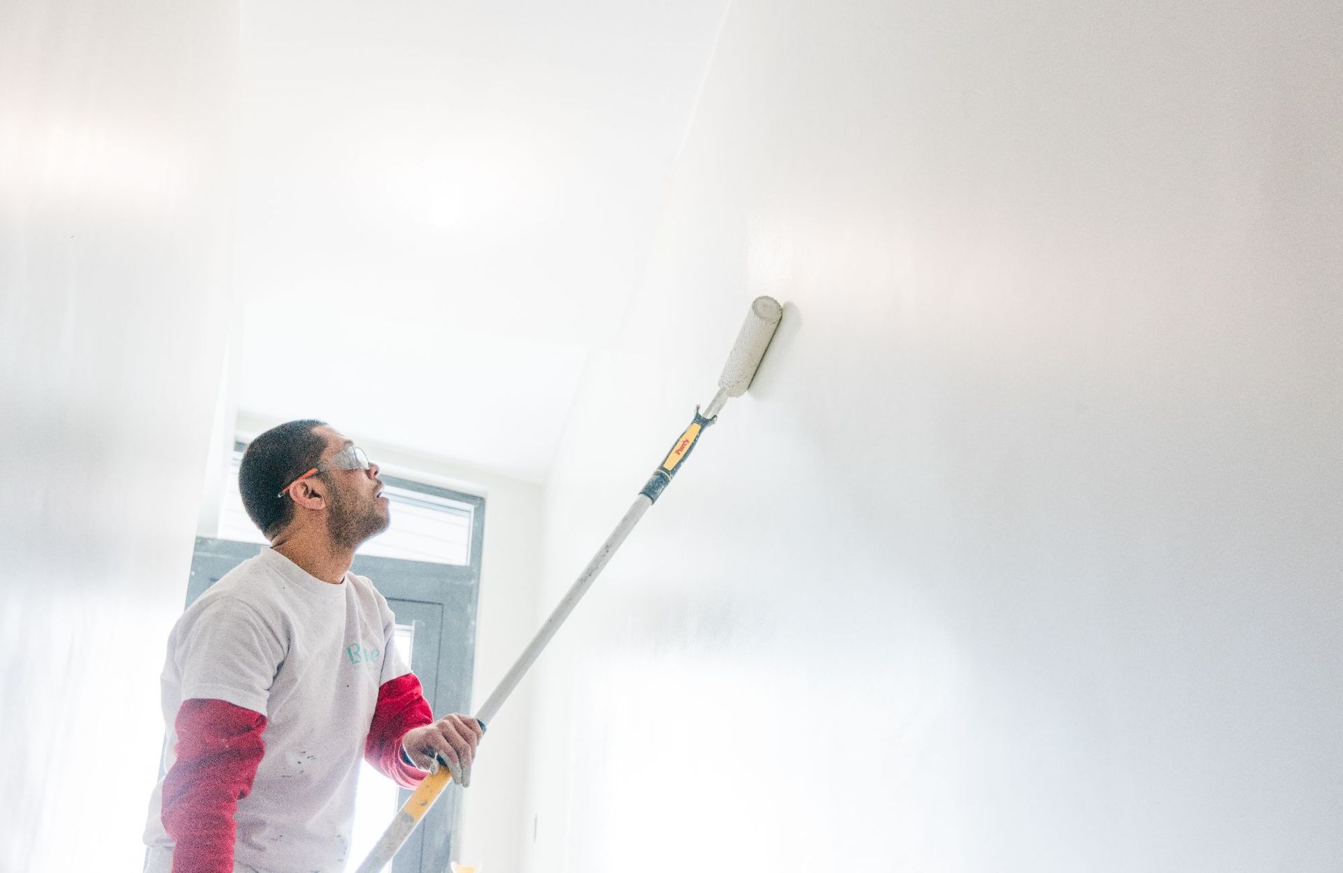
Business continuity stays our top priority while we paint. We work around your business schedule and offer flexible options like after-hours painting, weekend work, or staged approaches. Your workplace can stay functional throughout the project. This careful planning helps keep productivity high while we change your workspace.
We use several proven strategies to reduce disruption when we must work during business hours. Our staged approach breaks down the project into smaller sections. This means only small areas of your workspace face disruption at once. We also use quick-drying, low-odor paints so your employees can return to freshly painted areas faster. Your team stays informed about timelines, affected areas, and completion dates throughout the process, which helps everyone adjust their routines.
Using safe, low-VOC paints for healthier air
Employee health guides our choice of materials. We use low and zero-VOC paints that release fewer harmful emissions than traditional paints. Traditional paint's volatile organic compounds can cause headaches, nausea, and breathing problems – these issues directly affect how your employees feel and work.
We choose paints that go beyond the strictest industry standards because we care about environmental responsibility. The benefits are clear – well-ventilated spaces with low-VOC paints reduce indoor air pollution, which causes 3.8 million deaths worldwide each year. These healthier paint options support your team's long-term well-being by eliminating the continuous off-gassing that conventional paints produce for years. Our comprehensive approach to office painting creates environments where your team can excel.
Finding the Best Commercial Painter in Saskatoon to Boost Workplace Morale
Our commercial painting experience has taught us how the right office colors can revolutionize workplace dynamics and lift employee morale. Studies prove that smart color choices create environments where teams thrive. Calming blues boost focus while energizing yellows fuel creativity. The careful blend of brand colors builds organizational identity and creates the perfect balance needed for workplace wellness.
We've seen it in countless office painting projects - employees in well-designed color environments are much more satisfied and engaged with their work. Color psychology might seem daunting, but our expertise helps businesses create spaces that support their team's varied needs. Break rooms with soothing greens and focus areas with concentration-boosting blues show how each shade plays its part in supporting employee wellbeing.
Professional office painting delivers benefits that go way beyond looks. Clean, fresh walls with safe, low-VOC paints show a company's dedication to its people and create healthier workspaces. Our smart approach to picking and applying colors helps businesses build environments where employees feel valued, motivated, and connected. Companies that invest in thoughtful office design through professional painting see returns through better team morale, increased efficiency, and a stronger organizational culture.
FAQs
Q1. How does color affect productivity in the workplace? Different colors can significantly impact workplace productivity. Blue is known to enhance focus and efficiency, while yellow can boost creativity and optimism. Green promotes balance and reduces eye fatigue, making it ideal for long work sessions. The key is to choose colors that align with the specific needs of each workspace.
Q2. Why is incorporating brand colors into office design important? Using brand colors in office design reinforces company identity and creates a sense of belonging among employees. It helps build a stronger connection between staff and the organization's mission, potentially leading to increased engagement and job satisfaction. However, it's crucial to balance brand colors with those that optimize workplace well-being.
Q3. What are the benefits of using low-VOC paints in office spaces? Low-VOC paints significantly reduce harmful emissions, creating a healthier work environment. They minimize the risk of headaches, nausea, and respiratory problems often associated with traditional paints. Using these environmentally responsible products can improve indoor air quality, contributing to better long-term employee health and well-being.
Q4. How can different office zones be color-coded for maximum effectiveness? Different areas of an office can be color-coded to support various functions. For focus areas, calming blues or greens can enhance concentration. Creative spaces benefit from energizing colors like yellow or orange to stimulate idea flow. Break rooms should use soothing shades like light blue or lavender to promote relaxation and stress relief.
Q5. What impact does a fresh paint job have on employee morale? A fresh paint job can significantly boost employee morale. It creates a clean, professional appearance that shows the company values its workspace and employees. This visual refresh can lead to increased motivation, engagement, and pride in the workplace. Employees often report feeling more valued and energized in a newly painted environment, which can translate to improved job satisfaction and productivity.